All of the following options concern the editor environment configuration files. These are typically located in config/environments/. We list all available config options here where necessary with links to other pages.
Toolbar
Some of the editing features visible in the top toolbar when you are editing a document can be configured.
E.g config/environments/all.js
app: {
  useSplitPane: true,
  useSelectionMode: true,
  useHistoryMode: true,
  undoRedoButtonsAreEnabled: true
}
Insert Panel
Advanced Component Groups
Availability of advanced features such as component search and collapsable component groups.
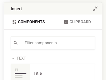
The search is automatically activated if there are more than 8 components.
Properties Panel
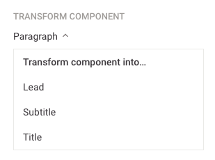
Transform Component
Visibility of the “Transform Component” select menu can be configured.
app: {
  editor: {
    propertiesPanel: {
      transformComponentEnabled: true
    }
  }
}
When the transform option is enabled, all compatible components become available. Compatibility is determined by the following rules:
- Components with exactly one directive can be transformed if the directive matches the target type.
- Components with multiple directives can only be transformed if all directives have matching names and types.
- Only directives of the following types are supported: editable, image, video, audio, and link. Components containing any other directive types cannot be transformed.
- Components must be permitted at their intended location within the document structure.
Images
There are several configuration options concerning images.
Image service
See here
Image cropping
See here
Sizes
app: {
  imageMinWidth: 300,
  imageMinHeight: 100
}
The image min width and height control if an image can be cropped or not.
Text Editing
See here
Embeds
By default, the Livingdocs core supports embeds of type Iframe:
iframe default ratio
{
  embeds: {
    iframe: {
      defaultRatio: 55
    }
  }
}
Iframes in Livingdocs use a special CSS trick to always be rendered in a given aspect ratio and scale automatically to the given width. In this way an iframe out of Livingdocs is never cut off at the sides. The default ratio of 55 is about a 16:9 aspect ratio. Use this formula to calculate the correct value for your custom default aspect ratio: (width / height) * 100.
This setting only sets the default ratio, a user is given an interface to change the aspect ratio inside of the Livingdocs editor.
Timeout
{
  http: {
    timeout: 10000
  }
}
Allows you to configure after how much time a timeout should happen in calls from the editor to the server. 10 seconds by default. In milliseconds.
Third-party services
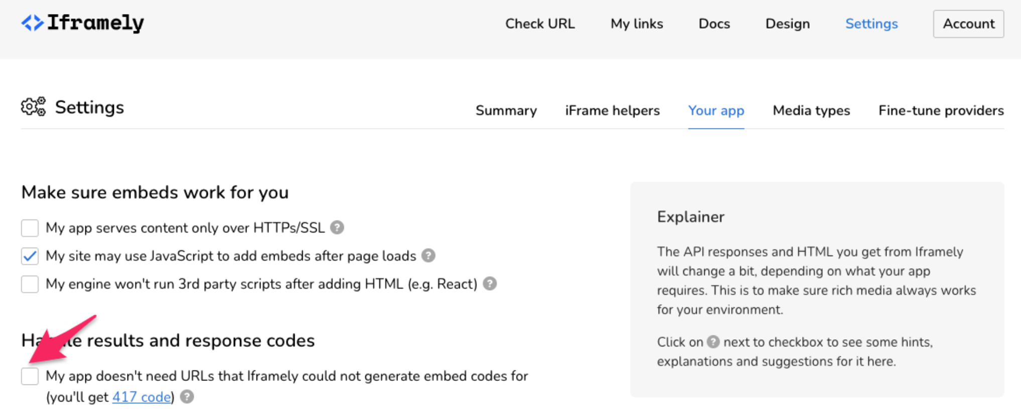
Iframely
{
  iframely: {
    apiKey: '***',
    apiUrl: 'https://iframe.ly/api/iframely'
  }
}
Iframely is used for 2 things:
- validating links that you enter in the text (see text editing)
- in combination with
doc-linkto prefill component from metadata
Settings for Iframely
When you have your own Iframely account, you should disable this setting (red arrow) to prevent issues with link external link validation in Livingdocs.
Spellcheck
See here
Links
See here
Keyboard Shortcuts
{
  keyboardShortcuts: {
    backspace: 'prevent backspace',
    escape: 'esc',
    enter: 'enter',
    up: 'focus previous component',
    down: 'focus next component',
    '⌘+up, ⌃+up': 'move component up',
    '⌘+down, ⌃+down': 'move component down',
    '⌘+z, ⌃+z': 'undo',
    '⌘+y, ⌘+shift+z, ⌃+y, ⌃+shift+z': 'redo'
  }
}
The keyboard shortcuts allow you to customize which keys you want to use for common actions in Livingdocs. The actions (values) are fixed. You can define on which keys you want to execute the actions.
The following actions are supported:
prevent backspaceescenterfocus previous componentfocus next componentmove component upmove component downdelete componentundoredoinsert middle dotinsert left guillemetsinsert right guillemetsinsert left double quotation markinserts“Added in:release-2024-03insert right double quotation markinserts”Added in:release-2024-03insert double low-9 quotation markinserts„Added in:release-2023-11insert double high-reversed-9 quotation markinserts‟Added in:release-2023-11insert en spaceinsert four-per-em spaceinsert en dashinsert figure dashinserts‒Added in:release-2023-11insert fract12insert fract14print interactive viewstart multiselect modeend multiselect modenext cardhighlights the next comment cardprevious cardhighlights the previous comment card
Multi Select and Multi Text Select
Selecting multiple components at once allows editors to delete a bulk of components. Editors can select multiple components by dragging from outside of the component view.
The selection of text across multiple components by dragging inside of a text component is enabled by default but can be disabled in the editable settings:
app: {
  editable: {
    multiEditablesTextSelection: false,
  }
}
Document Copy
{
  app: {
    copy: {
      isEnabled: true
    }
  }
}
If the copy feature is enabled, it allows you to copy and transform documents.
Comments
Comments are a great way for editors to communicate about a text. To enable it, add the following block to your editor config:
comments: {
  isEnabled: true,
  defaultForDocumentType: {
    article: true,
    page: false
  }
}
The defaultForDocumentType section allows you to separately turn comments off for articles and pages.
It’s also possible to turn on/off Comments for a specific Content Type.
It is worth noting that comments cannot be enabled on Editable Document Teasers.
The notification feature needs to be enabled if the mentioned users should get a notification. Notification feature
Pin components
Pinning of components enables a pin icon next to a component card in the sidebar. When clicked the component is pinned according to the rules:
- if it is alone in a container it can not be moved, deleted nor can anything be moved or inserted before or after it (perfect for a fixed article header)
- if it is next to other components, it can not be moved nor deleted, but other components can be moved or inserted around it
pinComponents: {
  isEnabled: true
}
Pinning is triggered by the position property on the component. You can also pin components over the defaultContent by setting the position to fixed in the JSON:
defaultContent: [
  {
    component: 'article-container',
    containers: {
      header: [
        {
          component: 'head',
          position: 'fixed'
        }
      ],
      main: [{component: 'image'}]
    }
  }
]
The UI allows users to unpin or pin a component. If you want to enforce pinning just disable the UI (pinComponents) and set the position to fixed programatically (e.g. by the default content).