Most of the text editing is handled by editable.js, an open-source library, maintained by Livingdocs. The Livingdocs editor allows different configurations to adapt the behavior of editable.js.
Toolbar
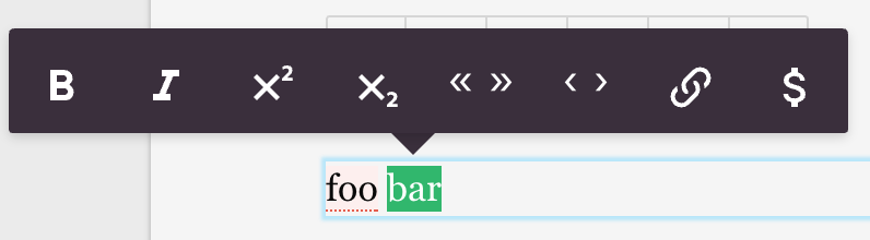
When you select some text in the editor you get a popover with some options on how to format text or what special characters to include. You can fully customize the options in the popover, like if you want to be able to toggle text bold, italic, etc. The configuration can be set for both web (default) or print (only relevant if you use the Livingdocs print editor).
Formatting Options
app: {
  editable: {
    'default': {
      bold: true,
      italic: true,
      superscript: false,
      subscript: false,
      link: true,
      specialChars: true,
      quotes: ['„', '“'],
      singleQuotes: ['‚', '‘'],
      apostrophe: '’',
      locales: {
        de: {
          quotes: ['„', '“'],
          singleQuotes: ['‚', '‘']
        },
        'de-CH': {
          quotes: ['«', '»'],
          singleQuotes: ['‹', '›']
        },
        en: {
          quotes: ['“', '”'],
          singleQuotes: ['‘', '’']
        }
      }
    }
  }
}
The example would result in a toolbar with a buttons for
bold, italic, double quotes, single quotes, link,
superscript, subscript and adding specialChars
(The apostrophe is currently only used for the pasting logic).
The locales config is only active if you have translations enabled.
With translations enabled when you create or open a document which has
a language assigned the quotes, singleQuotes and apostrophe configs
for the current language will be used if set (Note that the locale value in the documents metadata must match the propertyName in locales for this to work).
Behavior when pasting text:
If quotes, singleQuotes or apostrophe are configured then
incorrect quotes and apostrophe will be replaced with the configured ones.
Per-component toolbar restrictions:
The above configuration applies globally to all editable directives. If you need to restrict the toolbar for a specific component (e.g. show no formatting options on a subtitle but retain the full toolbar on a paragraph), you can use plainText on the component’s editable directive. See the Editable directive docs for details.
Custom Elements
The text formatting toolbar can also be extended with custom configured elements. These elements will be shown in the toolbar after the default elements.
They can be configured in the customElements array in the textFormatting object, typically located in projectConfig.editorSettings.
There is limited support for the use of metadata plugins. For example, li-text or li-enum can be used to inject text values.
Note that metadata plugins used in these instances will not be fully configurable and will have only limited functionality. Use sparingly.
Example:
textFormatting: {
  customElements: [
    {
      label: 'blue color',
      handle: 'bluecolor',
      // the tag which is set around the selection
      tagName: 'span',
      // if trim is set to true, whitespaces on the left and right of the selection are removed
      trim: true,
      // the icon which will be displayed. Only existing icons in the editor can be used.
      icon: 'format-color-highlight',
      // the attributes which are set on the tag
      attributes: [
        { name: 'class', value: 'blue' }
      ]
    },
    // example using a plugin
    {
      label: 'Add Note',
      handle: 'inline-note',
      tagName: 'span',
      trim: true,
      icon: 'comment-outline',
      attributes: [
        {
          handle: 'inlineNoteText',
          type: 'li-text',
          name: 'inline-note'
        }
      ]
    }
  ]
}
Special Characters
The specialChars can be configured separately. The button for special chars (a $ sign) opens a second popover with a tabbed selection of special characters that you want to allow your users to insert. A configuration for specialChars looks as follows.
app: {
  specialChars: [
    {
    'name': 'general',
    'label': 'General',
    'charList': [
      {
          'name': 'EN DASH',
          'label': '–',
          'caption': null,
          'value': '–',
          'description': 'Dash of 1 en length'
        },
        {
          'name': 'VULGAR FRACTION ONE HALF',
          'label': '½',
          'caption': null,
          'value': '½',
          'description': 'Fraction: one half'
        }
        ]
      },
      {
        'name': 'white_spaces',
        'label': 'White Spaces',
        'charList': [
          {
            'name': 'EN SPACE',
            'label': '◅···▻',
            'caption': 'en',
            'value': ' ',
            'description': 'EN Space'
          },
          {
            'name': 'FOUR-PER-EM SPACE',
            'label': '◅··▻',
            'caption': '1/4',
            'value': ' ',
            'description': '1/4 EM Space'
          }
        ]
      }
    ]
  }
Advanced Formatting Options
In addition to configuring what options the text toolbar gives to your users you can also configure to some extent the HTML markup that is inserted when a formatting option is selected. Currently, you can configure the markup for bold, italic and link. An example is below.
app: {
  editable: {
    formatting: {
      boldMarkup: {
        type: 'tag',
        name: 'strong',
        // if trim is set to true, whitespaces on the left and right of the selection are removed
        trim: true,
        attribs: {
          'class': 'foo'
        }
      },
      italicMarkup: {
        type: 'tag',
        name: 'em',
        // if trim is set to true, whitespaces on the left and right of the selection are removed
        trim: true,
        attribs: {
          'class': 'bar'
        }
      },
      linkMarkup: {
        type: 'tag',
        name: 'a',
        // if trim is set to true, whitespaces on the left and right of the selection are removed
        trim: true,
        attribs: {
          'class': 'foo bar'
        }
      }
    }
  }
}
A common use case for this is when you want to insert some CSS classes around your formatted text, as in the example above. You are not restricted to the class attribute however but can configure any HTML attribute you like.
Paste Formatting Options
You can configure how pasted text content is filtered.
Here you see the default configuration. Any property you define
in pastedHtmlRules will be merged into the default configuration.
app: {
  editable: {
    formatting: {
      // ...
      pastedHtmlRules: {

        // Elements and their attributes to keep in pasted text
        // Note that elements not explicitly allowed here will not be removed, their
        // tags will get stripped but their content will be kept. Use `blacklistedElements`
        // to get rid of a whole element (tag+content)
        allowedElements: {
          'a': {
            'href': true,
            'rel': true,
            'target': true
          },
          'strong': {},
          'em': {},
          'br': {}
        },

        // Elements that have required attributes.
        // If these are not present the elements are filtered out.
        // Required attributes have to be present in the 'allowed' object
        // as well if they should not be filtered out.
        requiredAttributes: {
          'a': ['href']
        },

        // Elements that should be transformed into other elements
        transformElements: {
          'b': 'strong',
          'i': 'em'
        },

        // A list of elements which should be split into paragraphs.
        splitIntoBlocks: ['h1', 'h2', 'h3', 'h4', 'h5', 'h6', 'p', 'blockquote'],

        // A list of HTML block level elements.
        // -> prevent missing whitespace between text when block-level
        // elements are removed.
        blockLevelElements: [
          'h1', 'h2', 'h3', 'h4', 'h5', 'h6', 'div', 'p', 'pre', 'hr', 'blockquote',
          'article', 'figure', 'header', 'footer', 'ul', 'ol', 'li', 'section', 'table', 'video'
        ],

        // A list of elements that will get completely removed when pasted. Their tags
        // and content (text content and child elements) will get removed.
        blacklistedElements: ['style', 'script'],

        // Do not remote a tags if the href is a relative path
        keepInternalRelativeLinks: false
      }
    }
  }
}
Text Editing Behavior
Newlines with Shift+Enter. Default: true
app: {
  editable: {
    allowNewline: false
  }
}
Allows the users to make a newline in a paragraph by pressing Shift+Enter. This will result in a <br> tag an might not always be wanted thus the ability to turn this off.
Events on Mouse selection. Default: false
app: {
  editable: {
    mouseMoveSelectionChanges: true
  }
}
By default the editable selection event is only fired once the user releases the mouse over a selection. With this setting you can already get events when the user still holds the mouse while making a selection. This is only useful if you want to somehow support the user during the process of making a selection and it will fire lots of events so be cautious with this one.
Spellcheck
Livingdocs allows you to use the default browser spellcheck, a custom spellcheck server or no spellchecking at all. The browser spellcheck is the default browser behaviour and will differ between Chrome, Firefox etc. The custom spellcheck requires a spellcheck service that analyzes the text and returns a list of words that have been spelled wrong. Thus the custom spellchecker is completely customizable.
Spellchecking turned off:
app: {
  editable: {
    // This will simply disable spellchecking on the `contenteditable` element.
    browserSpellcheck: false
  }
},
spellcheck: {
  isEnabled: false
}
Default browser spellchecking:
app: {
  editable: {
    browserSpellcheck: true
  }
},
spellcheck: {
  isEnabled: false
}
Custom spellchecker (examples are NZZs vademecum or Duden):
app: {
  editable: {
    // This will simply disable spellchecking on the `contenteditable` element. This is
    // recommended when using a custom spellchecker.
    browserSpellcheck: false
  }
},
spellcheck: {
  isEnabled: true,
  'host': 'http://your-spellcheck-server.com'
}
If a custom spellcheck service is configured, Livingdocs makes requests to
the configured endpoint with a text parameter containing text from
individual paragraphs.
Example request:
GET http://your-spellcheck-server.com/spellcheck/check?text=foobar
Spellcheck response with no corrections:
{"status": true}
Spellcheck response with corrections:
{"status": false, "bad": [{"word": "falsch", "pos": 0}]}
Underline technique
Misspelled text is highlighted with a dotted red underline in the editor. There are two ways how to render such an underline:
- Using the CSS
text-decorationproperty - Using the CSS
border-bottomproperty
If both the Livingdocs spellcheck component and the surrounded text component (e.g. a link directive) use the same technique, then only one line will be visible. The following graphic shows which combinations are valid:
| Spellcheck | Other Component |
|---|---|
| border | text-decoration |
| text-decoration | border |
| none | text-decoration, border |
Please configure a valid combination using the spellcheck.underline setting.
The default value is border.
spellcheck: {
  isEnabled: true,
  underline: 'text-decoration'
}
Character Counter

Deprecated in: release-2024-05</span
. Please migrate to
projectConfig.editorSettings.textCount(see here).
A character counter can be configured. The counter can be limited to only count text within certain components.
textcount: {
  isEnabled: true,
  showEditableCount: true // shows the chars of the selected doc-editable
  timeout: 200
}
Excluding components and directives (configured in the Livingdocs component library)
It is also possible to only count the text of selected components or directives. This is configured in the component library of a Livingdocs design.
Exclude whole components from the text counter (example component config):
{
  "name": "aside",
  "label": "Aside",
  "excludeFromTextCount": true
}
Exclude individual directives from the text counter (example component config):
{
  "name": "quote",
  "label": "Quote",
  "directives": {
    "text": {"excludeFromTextCount": true},
    "source": {"excludeFromTextCount": true}
  }
}
Links
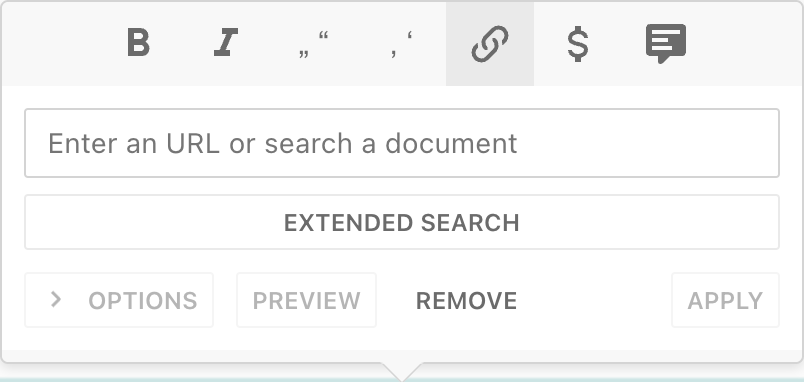
Options
To enable links that are relative paths (e.g. “/departments/technology”) or anchor hashes (e.g. #more-on-this), turn on editor environment config links.allowRelativeUrls or links.allowAnchorLinks.
If you set the internal hosts as regex, you can define default behavior for internal and external links.
If you configure deliveries in your Project Config links to these deliveries will be treated as internal links as well and you don’t need to define the internalHostsRegex.
// in editor environment config
{
  links:{
    allowRelativeUrls: false,
    allowAnchorLinks: false,
    allowMailToUrls: true,
    internalHostsRegex: ['^(https?://)?(www.)?foo.com', '^(https?://)?(www.)?bar.io'],
    internalDefaults: {
      openInNewWindow: false,
      follow: true
    },
    externalDefaults: {
      openInNewWindow: true, -> // will resolve to `<a target="_blank"></a>`
      follow: false -> // will resolve to `<a rel="nofollow"></a>`
    }
  }
}
Link Search settings
You can customise the behaviour of the link search, in the editor settings (in the server), by defining filters or by using a custom dashboard.