Document Teasers based on Includes provide a simple way to setup teasers and the possibility to define the UI with a paramsSchema.
To drag and drop Document Cards onto a document to create Teaser Components you need to configure Teaser Components using an Include Service with a li-document-reference param to make it work.
This guide assumes that you are familiar with the possibilities to register an Include Service and how to use it in a Component.
Teaser Component
First of all we create a article-teaser component which will be visible within the editor’s sidebar. The directive of type include allows us to define a service we can then use to feed the include as well as the final teaser component.
// article-teaser.js
module.exports = {
  name: 'article-teaser',
  label: 'Teaser',
  iconUrl: 'path/to/an/icon',
  directives: [
    {
      name: 'teaser-include',
      type: 'include',
      // refer to the include service handle
      service: 'teaser-service',
      // extend the config for li-document-reference type input
      paramsSchemaExtension: [
        {
          // refer to the handle of the services paramsSchema property
          name: 'article',
          // configure base filters for the article search modal
          config: {
            // only document of contentType 'regular'
            contentType: ['regular'],
            // only published documents
            published: true
          }
        }
      ]
    }
  ],
  html: `
    <div doc-include="teaser-include">
      <div class="placeholder">Link an Article</div>
    </div>
  `
}
Register components
This component we add to the project settings under the components property to be able to use the component.
// index.js of projects.config
{
  v: 2,
  //...
  components: [
    // Register the article-teaser component
    require('./components/article-teaser'),
    // the teaser itself will be created later and represents the content of the visible teaser
    require('./components/article-teaser-template')
  ]
  //...
}
And we define the component in the contentTypes we want to use them:
// article.js
{
  handle: 'article',
  documentType: 'article',
  // ...
  components: [
    // here we add it to the contentType so it is available within the sidebar
    {name: 'article-teaser'}
  ],

  // optionally you can group it within the sidebar
  componentGroups: [
    {
      name: 'text',
      label: {en: 'My Teasers', de: 'Meine Teaser'},
      components: ['article-teaser']
    }
  ]
}
Now we have already defined the basic setup for our teaser as a include component. See Include for detailed description of the include feature.
Teaser Service
We now can create the service we referenced above by the service property which will handle our include as desired. On the service we will
reference our final article-teaser-template component within the return object sent to the editor. This way the editor knows what component to use as teaser and how to render its markup. This is an example of a return object sent by the service:
return {
  // editableContent defines weather the user is able to change populated values within the teaser or not
  editableContent: true,
  content: [
    {
      id: 'some-unique-id',
      // here we define the desired component from which the teaser finally will be rendered
      component: 'article-teaser-template',
      content: {
        // all directives defined here are references to the 'article-teaser-template'
        // component and will be populated later within the editor
      }
    }
  ]
}
Here is a minimal working example of our service including configuration to consider for the editable teaser usecase. For more information about the editableContent property see Editable Document Teasers
// teaser-service.js
module.exports = function ({publicationApi, documentApi}) {
  return {
    name: 'teaser-service',
    // this will render a UI in the document editing sidebar to let the User select a document with
    // the contentType `regular` to link to.
    paramsSchema: [
      {
        handle: 'readOnly',
        type: 'li-boolean',
        ui: {
          label: {en: 'Read-Only Teaser', de: 'Schreibgeschützter Aufmacher'}
        }
      },
      {
        handle: 'article',
        type: 'li-document-reference',
        preload: true,
        ui: {
          label: 'Teaser',
          config: {
            style: 'teaser'
          }
        }
      }
    ],
    rendering: {
      type: 'function',
      async render(params, context) {
        // params.article.reference.id contains the id of the linked document
        // params.article.value contains part of the DocumentVersion ({systemdata, metadata})
        // of the include (because preload: true is configured)
        const documentVersion = params.article.value
        return {
          editableContent: !params.readOnly,
          content: [
            {
              id: `teaser-${documentVersion.systemdata.documentId}`,
              component: 'article-teaser-template',
              content: {
                image: parseImageData(documentVersion.metadata.teaserImage),
                title: documentVersion.metadata.title,
                lead: documentVersion.metadata.lead
              }
            }
          ]
        }
      }
    }
  }
}

// this local function resolves the proper image data for the above return
function parseImageData(metadata, key) {
  if (!(key in metadata)) return undefined

  const teaserImage = metadata[key]
  if (!teaserImage) return undefined

  // The teaser image is of type li-image but the editable-teaser service
  // requires LivingdocsImageDirective, so this picks the correct values
  return {
    url: teaserImage.url,
    originalUrl: teaserImage.originalUrl,
    mediaId: teaserImage.mediaId,
    imageService: teaserImage.imageService,
    width: teaserImage.width,
    height: teaserImage.height,
    mimeType: teaserImage.mimeType,
    focalPoint: teaserImage.focalPoint
  }
}
Also we need to register the service within our setup:
// runtime_config.js
const liServer = Server(require('../conf'))

liServer.registerInitializedHook(() => {
  const documentApi = liServer.features.api('li-documents').document
  const publicationApi = liServer.features.api('li-documents').publication
  //...

  liServer.registerIncludeServices([
    // here we register our service
    require('./plugins/includes/teaser-service')({publicationApi, documentApi})
  ])
}
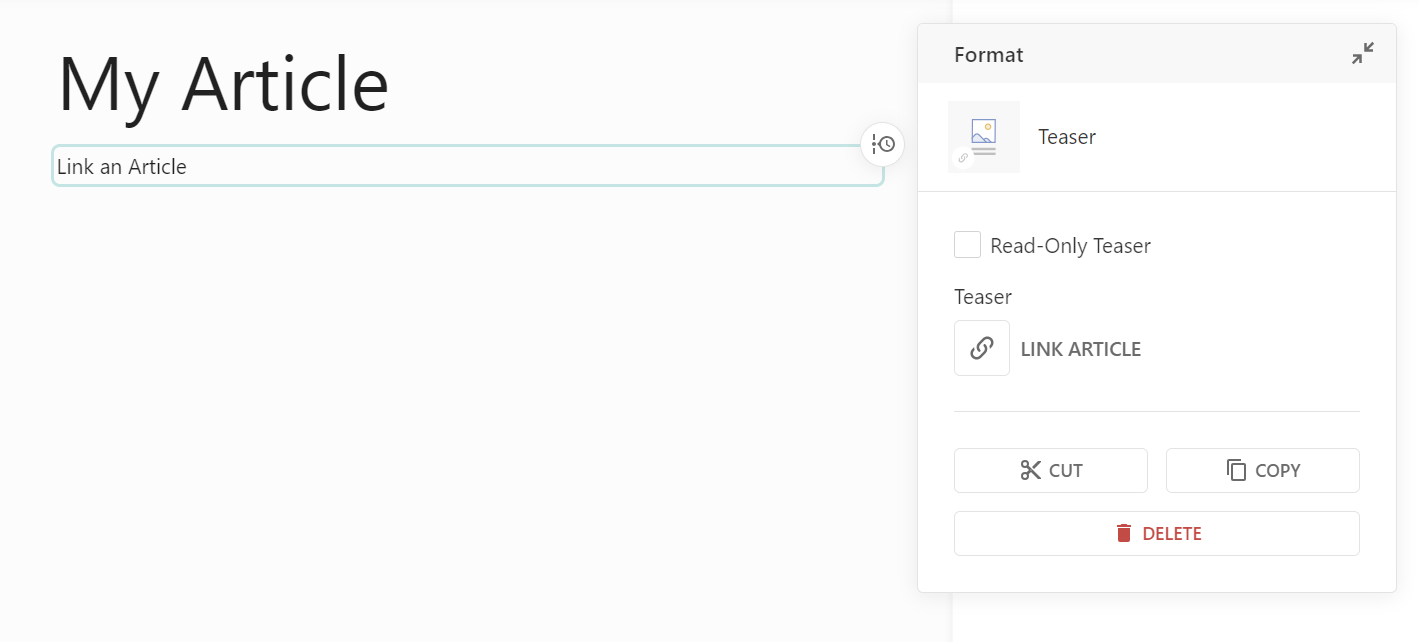
Now we see already the outcome of the article-teaser and the teaser-service we added. When no article is referenced after addding the include to the document, the include’s markup “Link an Article” is rendered. On the right side we see the defined paramsSchema from our service.
For a detailed description of the include api see Includes Server API.
Teaser Template Component
We now have a registered include component article-teaser and service teaser-service and it is time to define our teaser template component article-teaser-template which will be rendered within the document (replacing the include’s placeholder markup). Rembember we already registerd article-teaser-template here for our project.
// article-teaser-template.js
module.exports = {
  name: 'article-teaser-template',
  label: 'Teaser Component',
  directives: [
    {
      name: 'image',
      type: 'image',
      allowOriginalRatio: true,
      imageRatios: ['16:9', '1:1', '4:3', '3:4']
    },
    {
      type: 'editable',
      name: 'title',
      maxLength: 10
    }
  ],
  properties: ['teaser-type'],
  html: `
    <div class="teaser" style="display: block;">
      <img class="responsive-img" doc-image="image">
      <h3 doc-editable="title">Title</h3>
      <p class="text" doc-editable="lead">
        Lead
      </p>
    </div>
  `
}
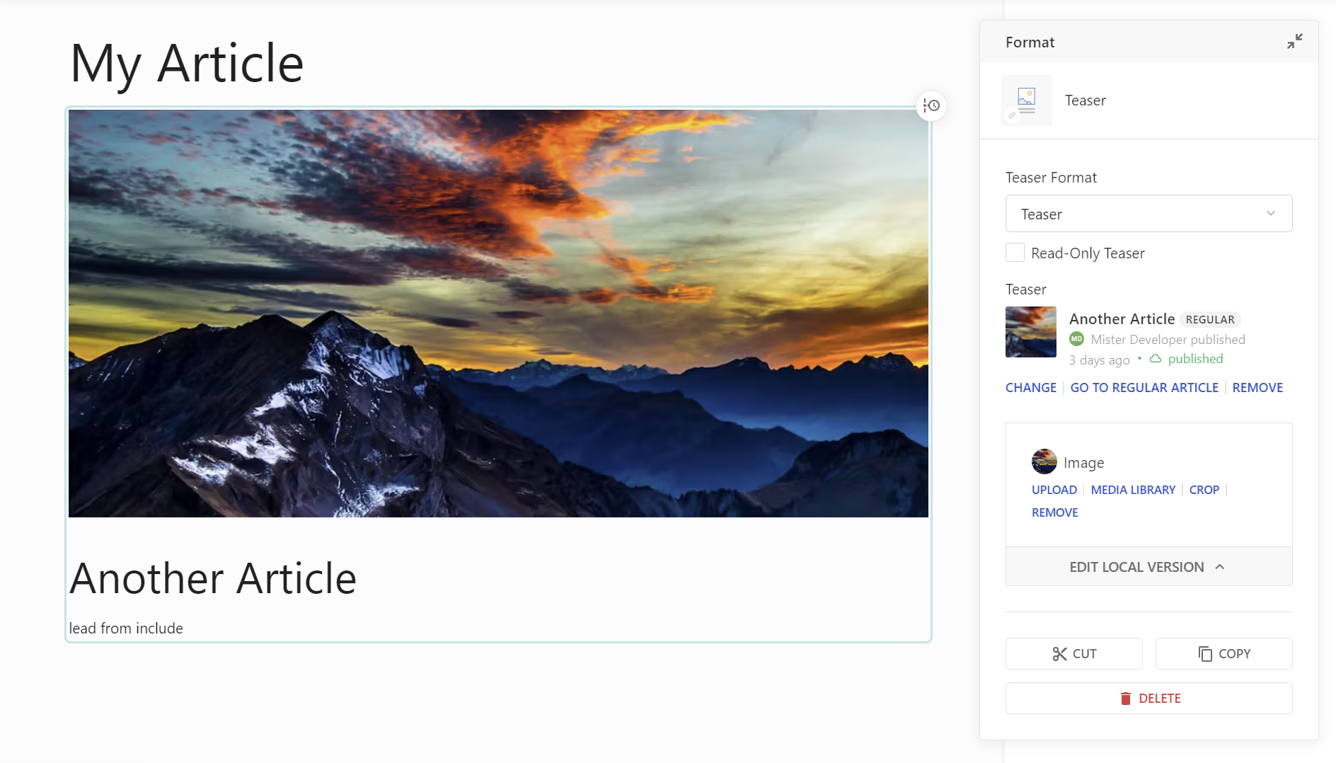
With the teaser finally in place we can link articles and the editor will populate the values as we return them out of our service. Also you can see the above directives of our teaser appear in a box on the sidebar (doc-image).
Document Dashboard in Editor
Now you want to configure a Teaser Dashboard for use in the Editor. For this, you configure an article dashboard first, then you can make use of it in the page ContentType.
Dashboards are configured in the Project Config editorSettings.
// Project Config
editorSettings: {
  dashboards: [
    {
      handle: 'articles-simple',
      type: 'tableDashboard',
      pageTitle: 'Articles',
      baseFilters: [
        {key: 'documentType', term: 'article'} // This must be set to 'documentType'
      ],
      displayFilters: [
        'channels',
        'documentState',
        'contentType',
        'timeRange',
        'language',
        'category'
      ],
      sort: '-published_at',
      columns: [
        {
          label: 'Title',
          minWidth: 100,
          growFactor: 1,
          priority: 1,
          componentName: 'liTableDashboardCellMain',
          componentOptions: {
            image: {
              metadataPropertyName: 'teaserImage'
            },
            clampTitle: false,
            showContentType: true
          }
        }
      ]
    }
  ]
}
// ...
By adding this dashboard to contentType.editor.documentEditingToolbar.documentDashboards, users will see a new button in the toolbar to open the dashboard in a side panel.

// page.js
{
  handle: 'page',
  documentType: 'page',
  //...

  editor: {
    documentEditingToolbar: {
      documentDashboards: [
        {
          label: 'Teaser',
          useDashboard: 'articles-simple',
          published: true
        }
      ]
    },
  }

}
Enabling Drag and Drop to create Teaser Components
All there is to do now, is adding a bit of config to let the system know, which Teaser Component should be created when dropping an Article card (source) from that dashboard into any document (target).
This is done in the source content Content-Type, in this case article.js:
// article.js
{
  handle: 'article',
  documentType: 'article',
  // ...
  teaserComponents: [
    {
      component: 'article-teaser',
      directiveName: 'teaser-include'
    }
  ]
}
teaserComponents is an array, as we support multiple teaser components from the same source content type. For example, you could have several teaser components with different sizes (S, M, L, XL).
The first teaser component in the array will be the default one.
The teaserComponents config must be added only to the source content type (article), not in the teaser component nor in the target content type.
Allow Import and Export in the Project Config
And adding the allowed import and export config to the project config:
  import: {
    allowedProjects: [{ handle: "exampleHandle" }],
  },
  export: {
    allowedProjects: [{ handle: "exampleHandle" }],
  }