Motivation
With the Table Dashboard introduced in March 2022 we have created upstream components configurable to suit most customer needs. A list of these components can be found here: Table Dashboard Cells.
We would highly recommend using these upstream components for several reasons:
- Less custom code: This reduces your implementation and maintenance costs
- The upstream components are better integrated with other features, for example: dashboard filters, metadata plugins and indexing
However, we also offer custom read-only cells for times when you have small requirements to display in a Table Dashboard. For example, if you have a custom metadata plugin you would like displayed or presented in a different way. The example below takes a publish control field and displays it in a specific way.
Guide
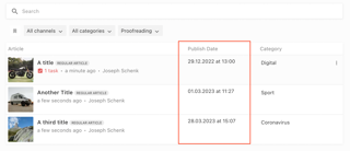
Below is an example dashboard cell showing the date and time property for a scheduled publish document using the new publish control
Custom Table Dashboard cells are passed two props, the document and custom options.
<template>
  <div>{{ publishDate }} at {{ publishTime }}</div>
</template>

<script>
import {format} from 'date-fns'
export default {
  name: 'customPublishTimeCell',
  props: {
    document: {
      type: Object,
      required: true
    },
    // Custom options provided through `componentOptions` in the dashboard config
    options: {
      type: Object,
      required: true
    }
  },
  data() {
    return {
      publishDate: this.getPublishDate(),
      publishTime: this.getPublishTime()
    }
  },
  methods: {
    getPublishDate() {
      const publishDate = this.document.publishControl.publishSchedule.date // UTC String, e.g. 2022-12-14T17:03:00.000Z
      return format(new Date(publishDate), 'dd.MM.yyyy')
    },
    getPublishTime() {
      const publishDate = this.document.publishControl.publishSchedule.date // UTC String, e.g. 2022-12-14T17:03:00.000Z
      return format(new Date(publishDate), 'HH:mm')
    }
  }
}
</script>
This must be registered in the vue component registry at the editor:
liEditor.vueComponentRegistry.registerComponent({
  type: 'tableDashboardCell',
  name: 'customPublishTimeCell',
  component: require('../custom-publish-time-cell.vue').default
})
And can be configured for use in a Table Dashboard in the Project Config editor in the editor settings in the server:
columns: [
  {
    label: 'Article',
    minWidth: 375,
    growFactor: 2,
    priority: 1,
    componentName: 'liTableDashboardCellMain',
    componentOptions: {
      image: {
        metadataPropertyName: 'teaserImage'
      },
      clampTitle: false,
      showContentType: true
    }
  },
  {
    label: 'Publish Time',
    componentName: 'customPublishTimeCell',
    minWidth: 200,
    growFactor: 0,
    priority: 2,
    componentOptions: {
      // Custom options passed to the component
    }
  },
  {
    label: 'Category',
    metadataPropertyName: 'category',
    editable: false,
    minWidth: 200,
    growFactor: 0,
    priority: 3
  }
]
This dashboard is pictured above and has three columns - the document title with a teaser image, scheduled publish time and the category.