---
title: Image Gallery
description: Walkthrough of how to setup an image gallery and a gallery teaser
---
## Goal
With this walkthrough we show how to set up an image gallery and an image gallery teaser, usually used for a slideshow. At the moment the concept of a gallery is not part of the core system, so we show you a way how Livingdocs would create an image gallery.
**Key features**
- You will have your own content-type "gallery" where you can create a slideshow
- You will have a gallery-teaser component to embed into your document
**Workflow**
First we add a few [gallery components](#add-gallery-components) and a new content type [gallery](#add-content-type-gallery). Then we [add](#integrate-gallery-to-your-project) the components and the content type to your project. In the next step we [add](#add-gallery-teaser-include) and then [register](#register-gallery-teaser-include) a gallery-teaser include. The last step [adds](#add-gallery-teaser-component) and then [integrates](#integrate-gallery-teaser-to-your-project) a gallery teaser component into your project.
## Expected Result
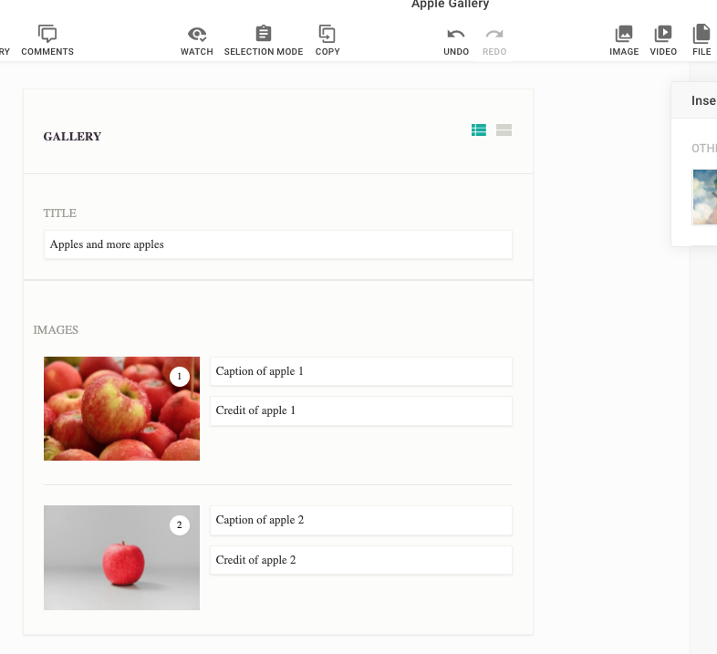
Content Type "gallery"
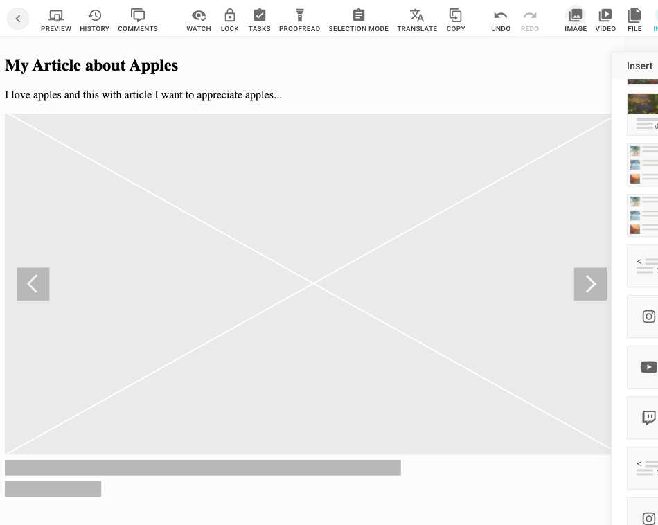
Gallery Teaser Placeholder (no gallery linked yet)
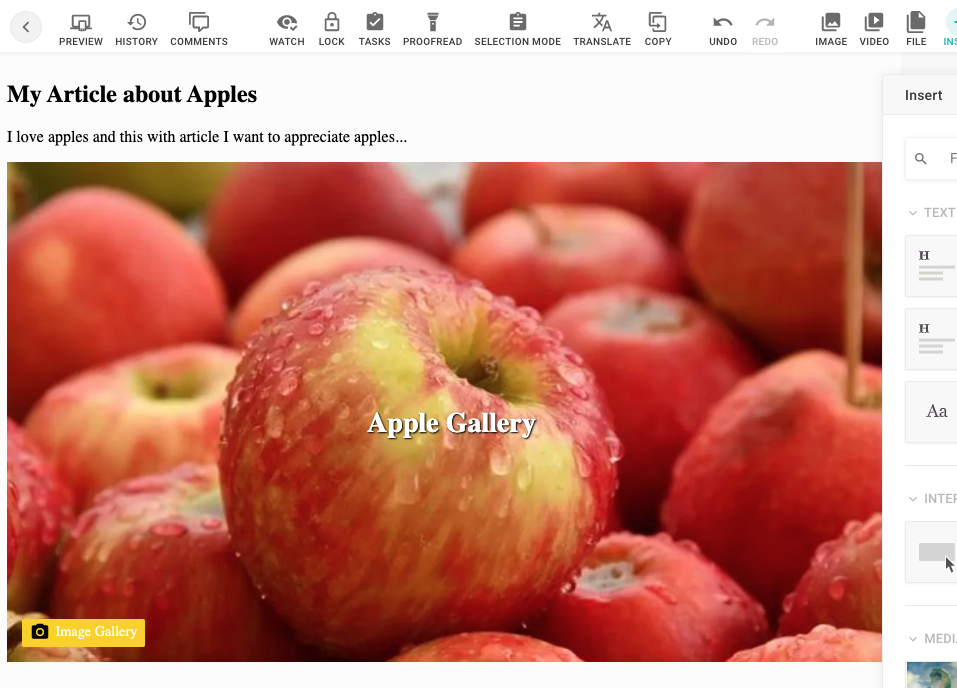
Gallery Teaser
## Guide
### Add Gallery Components
```js
// your-project/components/asset-container-gallery.js
const dedent = require('dedent')
module.exports = {
name: 'asset-container-gallery',
label: 'Gallery Container',
description: '1 column to add images',
iconUrl: 'https://livingdocsio.github.io/livingdocs-design-assets/docs/icons/component-icons/icon_component_layout.svg',
html: dedent`
`,
directives: [
{
name: 'gallery',
type: 'container',
allowedChildren: ['asset-image'],
defaultComponents: {
image: 'asset-image'
}
}
]
}
```
```js
// your-project/components/asset-content.js
const dedent = require('dedent')
module.exports = {
name: 'asset-content',
label: 'Asset Content',
description: 'Main container for assets',
iconUrl: 'https://livingdocsio.github.io/livingdocs-design-assets/docs/icons/component-icons/icon_component_1_column.svg',
directives: [
{
name: 'header',
type: 'container',
allowedChildren: ['asset-head-gallery']
}
],
html: dedent`
`
}
```
```js
// your-project/components/asset-head-gallery.js
/* eslint-disable */
const dedent = require('dedent')
module.exports = {
name: 'asset-head-gallery',
label: 'Asset Gallery Header',
description: 'Header and Title Field',
iconUrl: 'https://livingdocsio.github.io/livingdocs-design-assets/docs/icons/component-icons/icon_component_header_full.svg',
html: dedent`
`,
directives: [
{
type: 'editable',
name: 'title',
excludeFromTextCount: true
}
]
}
```
```js
// your-project/components/asset-image.js
const dedent = require('dedent')
module.exports = {
name: 'asset-image',
label: 'Asset Image',
description: 'Image with caption',
iconUrl: 'https://livingdocsio.github.io/livingdocs-design-assets/docs/icons/component-icons/icon_component_image.svg',
directives: [
{
name: 'image',
type: 'image',
imageRatios: ['16:9', '1:1', '4:3', '3:4'],
allowOriginalRatio: true
},
{
name: 'caption',
type: 'editable',
excludeFromTextCount: true
},
{
name: 'source',
type: 'editable',
excludeFromTextCount: true
}
],
html: dedent`
`
}
```
### Add Content Type "gallery"
```js
// your-project/content-types/gallery.js
module.exports = {
handle: 'gallery',
documentType: 'article',
info: {
label: 'Gallery',
icon: 'image-multiple'
},
components: [{name: 'asset-image'}],
editorWrapper: '',
defaultContent: [
{
component: 'asset-content',
position: 'fixed',
containers: {
header: [{component: 'asset-head-gallery', position: 'fixed'}],
body: [
{
component: 'asset-container-gallery',
containers: {
gallery: [{component: 'asset-image'}, {component: 'asset-image'}]
}
}
]
}
}
]
}
```
### Integrate Gallery to your project
```js
// your-project/index.js
{
// Add gallery content type to your project
contentTypes: [
//...
require('./content-types/gallery'),
],
// Add components to your project
{
components: [
// ...
require('./components/asset-container-gallery'),
require('./components/asset-content'),
require('./components/asset-head-gallery'),
require('./components/asset-image')
]
},
// Add UI and behaviour for the asset/gallery components in the Gallery Content Type
designSettings: {
assets: {
css: [
'https://livingdocs-assets.s3.eu-west-1.amazonaws.com/documentation-examples/li-gallery.css'
],
js: [
'https://livingdocs-assets.s3.eu-west-1.amazonaws.com/documentation-examples/li-gallery.js'
]
}
}
}
```
### Add "gallery-teaser" Include
```js
// /plugins/includes/gallery-teaser.js
'use strict'
/* eslint-disable */
const _ = require('lodash')
const dedent = require('dedent')
module.exports = function ({publicationApi}) {
return {
name: 'gallery-teaser',
paramsSchema: [
{
handle: 'teaser',
type: 'li-document-reference',
preload: true,
ui: {
label: 'Image Gallery'
}
}
],
rendering: {
type: 'function',
render (params, context) {
return renderTeaser({params, context, publicationApi})
}
}
}
}
async function renderTeaser ({params, context, publicationApi}) {
const isPreview = context?.preview === true
const documentId = params?.teaser?.reference?.id
// Return an empty string when no gallery is assigned and an API is doing the request
if (!documentId && !isPreview) return {html: ''}
// Show the include placeholder for the editor when no gallery is assigned
else if (!documentId && isPreview) return {doNotRender: true}
try {
const documentVersion = await publicationApi.getLatestPublication({documentId})
const apiContent = documentVersion.content[0]
// isPreview = true defines that the teaser is requested by the editor as a preview
// You can send any preview to the editor even when the output to the publicAPI
// would be different
// In this preview we want to return a simple gallery teaser (called gallery-teaser-resolved)
// which only shows a title a teaserimage and a text without any interactivity like sliding to the next image in the gallery
const previewContent = [{
id: `gallery-teaser-${documentId}`,
component: 'gallery-teaser-resolved',
content: {
title: documentVersion.title,
image: documentVersion.teaserImage.url
text: documentVersion.description
}
}]
return {
editableContent: true,
content: isPreview ? previewContent : apiContent
}
} catch (err) {
return !isPreview
? {html: ''}
: {html: galleryIsNotPublishedPlaceholder}
}
}
const galleryIsNotPublishedPlaceholder = dedent`
`
```
### Register "gallery-teaser" Include
```js
// app/server.js
liServer.registerInitializedHook(() => {
const publicationApi = liServer.features.api('li-documents').publication
liServer.registerIncludeServices([require('./include-services/gallery-teaser')({publicationApi})])
})
```
### Add "gallery-teaser" component
```js
// your-project/components/gallery-teaser.js
'use strict'
/* eslint-disable */
module.exports = {
name: 'gallery-teaser',
label: 'Image Gallery Teaser',
iconUrl: 'https://livingdocsio.github.io/livingdocs-design-assets/docs/icons/component-icons/icon_component_slideshow.svg',
directives: [
{
name: 'gallery',
type: 'include',
service: 'gallery-teaser',
paramsSchemaExtension: [
{
name: 'teaser',
config: {
contentType: ['gallery'],
published: true
}
}
]
}
],
// placeholder as svg base64 encoded
// https://github.com/livingdocsIO/livingdocs-design-assets/blob/master/docs/placeholders/placeholder-inline-gallery.svg
html: `
`
}
```
```js
// your-project/components/gallery-teaser-resolved.js
/* eslint-disable */
const dedent = require('dedent')
module.exports = {
name: 'gallery-teaser-resolved',
html: dedent`
`,
label: 'Image Gallery Hero Template',
directives: [
{
name: 'image',
type: 'image',
imageRatios: ['16:9'],
allowOriginalRatio: false
}
]
}
```
### Integrate "gallery-teaser" to your project
```js
// your-project/index.js
{
designSettings: {
componentGroups: [
{
name: 'includes',
label: 'Includes',
components: [
'gallery-teaser'
]
}
]
},
components: [
require('./components/gallery-teaser'),
require('./components/gallery-teaser-resolved')
]
}
// your-project/content-types/article.js
module.exports = {
components: [
{name: 'gallery-teaser'}
]
}
```
## References
- [Includes Overview](/reference/document/includes/llms.txt)

