 We suggest to use Metadata Previews instead. It will let users see the preview immediately when editing a metadata field.
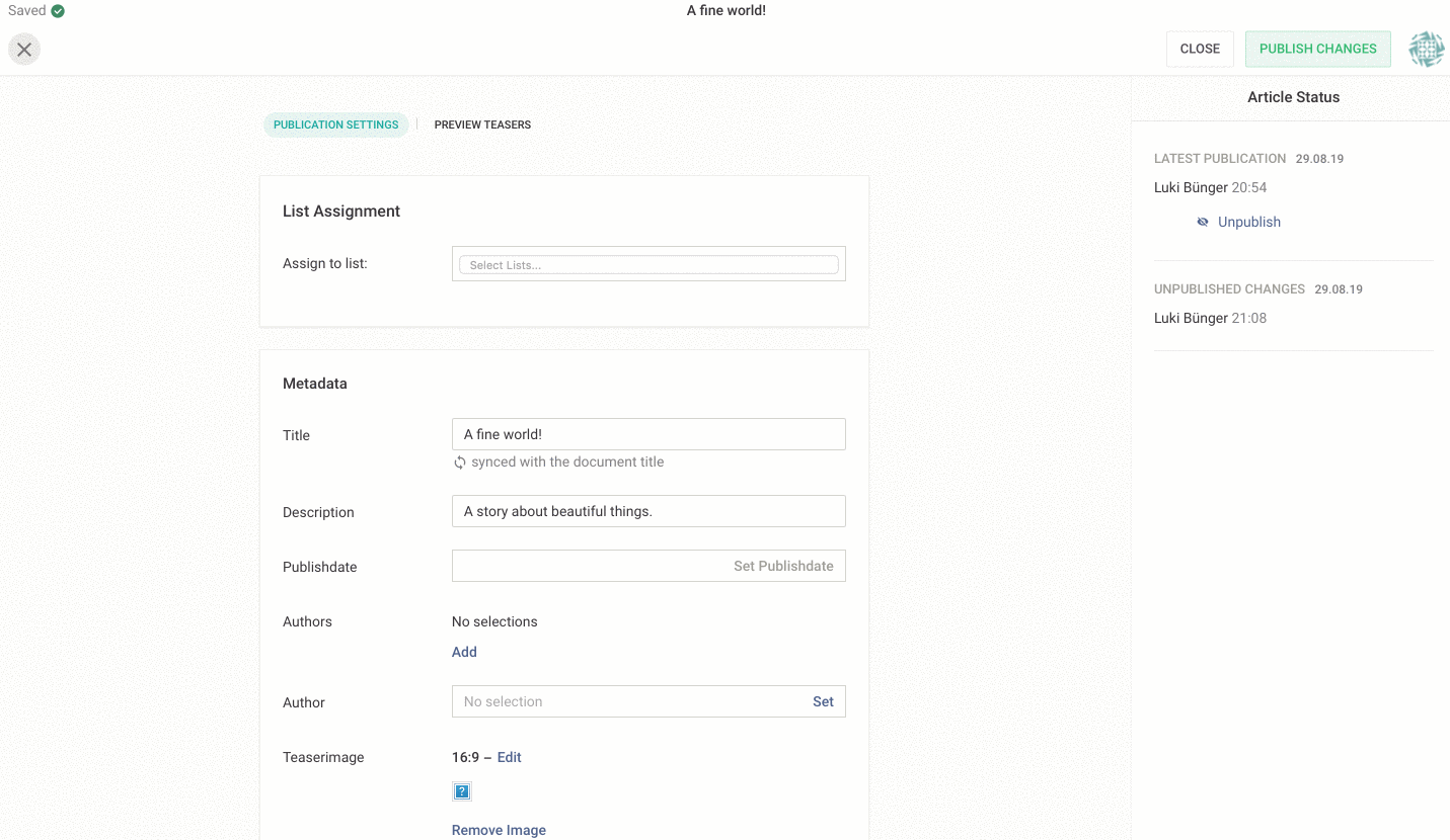
The Teaser Previews add an additional read-only view to the Metadata Form Section of the Livingdocs Editor. It is by default disabled and can only be enabled and configured through a content type config.
We basically configure a mapping that translates a subset of the current document (the one we are editing / publishing) into a state that gets rendered using components from your design. Further we can also control the dimensions and look of the preview.
Please note: This documentation assumes that you have a channel and a design and at least one content type properly set up.
Minimalist example
teaserPreview: {
  enabled: true,
  renderSettings: [
    {
      handle: 'normal',
      windowWidth: 320
    }
  ],
  teasers: [
    {
      componentName: 'title',
      label: 'Title Teaser',
      renderSetting: 'normal',
      directives: [
        {
          name: 'title',
          source: ['metadata.title']
        }
      ]
    }
  ]
}
This roughly translates into the following:
Render component
'title'into a viewport using render settings'normal'with the directive'title'prefilled with what was found under'metadata.title'on the source object.
Source object schema
A subset of a document structure that you will be able to write lookups against. The metadata object gives access to all properties you set up using metadata plugins
{
  // The document id
  id: 100
  // The documents title
  title: 100,
  // Any metadata on the document
  metadata: {
    // title,
    // description,
    // teaserImage,
    ...
  }
}
Full schema
teaserPreview: {
  // Whether the preview is enabled.
  enabled: true,

  // A set of objects that define the size of the
  // rendered preview viewport. This section
  // controls the actual preview.
  renderSettings: [
    {
      // An identifier of your choosing.
      handle: 'sidebar',

      // A numeric value (absolute pixels) for the viewport width.
      windowWidth: 640,

      // Optional. A numeric width (absolute pixels) for the viewport height.
      // Only set this if you want to enforce fixed dimensions. If ommitted, the height
      // of viewport will auto-adjust.
      windowHeight: 320,

      // Optional. A DOM string representing a wrapping component for the teaser.
      // Use this to give the teaser some context e.g. by emulating a sidebar.
      wrapper: '<div class="page__navigation"></div>'
    }
  ],

  // A set of teaser components you want to have rendered as previews.
  // Basically any component from your design can act as a teaser.
  teasers: [
    {

      // The name of the component as defined in the related design.
      componentName: 'teaser-sidebar',

      // Optional. The label for the teaser preview. Falls back to the label as
      // defined in the related design.
      label: 'Sidebar Teaser',

      // Refers to a handle in `renderSettings`
      renderSetting: 'sidebar',

      // A list of directives you want to prefill with content
      directives: [
        {
          // The name of the directive.
          name: 'embed',

          // A list of possible lookups on the passed source object.
          // Accepts dot-formatted strings for nested value access.
          // The first lookup in the list that gets a match against the
          // source object will get used to determine the value of the
          // directive mapping.
          source: ['metadata.myCustomid', 'id'],

          // Optional. If you target directives that operate on object content
          // (e.g. `doc-include` directives), you can provide a dot-formatted
          // target parameter. The resolved source value will then get set on the
          // content object.
          // If you omit this, the resolved source value will get set on the directive
          // "as is". This is useful when targeting `doc-editable` directives
          target: 'params.mediaId'
        }
      ]
    }
  ]
}
Stuff worth noting
- Render settings should usually omit the
windowHeightparameter as this lets the viewport auto-adjust its height. - Use the
windowHeightsetting to create a fixed view port. This is useful if you want to render teasers depending on a static display aspect ratio. - Use the wrapper to emulate the context of your teasers. Remember, you have all your design styles/classes at your disposal.
- Mind your media queries! As the preview will live in an
iframewith all the design styles loaded, thewindowWidthwill directly affect width-related media queries. You could also use this to your advantage to e.g. preview mobile versions of teasers. - If a rendered wrapper is wider than
windowWidth, the contents are scaled, or zoomed out, to fit the required width.
Examples
Example 1
In a design, with a teaser component teaser:
<div class="teaser">
    <h1 doc-editable="title"></h1>
    <img doc-image="image"></img>
    <p doc-image="lead"></p>
</div>
Extend a content-type config:
contentTypes: [
  {
    handle: 'regular',
    documentType: 'article',
    teaserPreview: {
      enabled: true,
      renderSettings: [
        {
          handle: 'sidebar',
          width: 320
        }
      ],
      teasers: [
        {
          name: 'teaser',
          size: 'sidebar',
          directives: [
            {
              name: 'title',
              source: ['metadata.title', 'title']
            },
            {
              name: 'image',
              source: ['metadata.teaserImage']
            },
            {
              name: 'lead',
              source: ['metadata.description', 'metadata.title']
            }
          ]
        }
      ]
    }
  }
]
Example 2
In a design, with a teaser component embed-teaser:
<div
  class="embed-teaser"
  doc-include="embed"
></div>
Extend a content-type config:
contentTypes: [
  {
    handle: 'regular',
    documentType: 'article',
    teaserPreview: {
      enabled: true,
      renderSettings: [
        {
          handle: 'wide',
          wrapper: `
            <section style="width:700px; display:flex; justify-content: center;">
            </section>
          `,
          windowWidth: 640
        }
      ],
      teasers: [
        {
          componentName: 'embed-teaser',
          label: 'Sidebar Teaser',
          renderSetting: 'sidebar',
          directives: [
            {
              name: 'embed',
              source: ['id'],
              target: 'params.mediaId'
            }
          ]
        }
      ]
    }
  }
]