Added in: release-2026-05
The Livingdocs Media Center already offers Media Library Dashboards for researching and browsing images, and the Document Inbox for collecting images for a specific article. However, neither provides a structured way to organise images for large or ongoing topics where collaboration across teams over a longer period of time matters.
Image Collections fill this gap. Editors can create named image collections and quickly access them whenever they need to pick an image for a document. For example, a collection might include photos from a recurring annual event, a specific photo shoot, or a defined subject area. Collections are persistent and shared across the project, making them suitable for team-based workflows.
Prerequisites
Before enabling Image Collections, you need at least one media type of type mediaImage configured in your project. See the Media Library Setup Guide for details.
Configuration
Project Config
Add the imageCollections property at the root of your project config:
// project config
module.exports = {
  imageCollections: {
    // Required: array of handles of allowed image mediaTypes
    mediaTypes: ['image'],
    // Optional: handle or array of handles of media library dashboards
    useDashboard: 'myImagesDashboard',
    // Optional
    pageTitle: {en: 'My Image Collections', de: 'Meine Bild-Sammlungen'}
  }
}
mediaTypes (required): An array of media type handles.
All referenced media types must be of type mediaImage. At least one handle is required.
This determines which images can be added to an image collection.
See the mediaType reference for more details on mediaTypes.
useDashboard (optional): The handle or an array of handles of existing Media Library Dashboards.
These dashboards are shown as tabs inside the dialog when browsing for images to add to a collection from within a collection.
More about that in Tabs in Media Library Sidepanels and Dialogs.
Make sure the dashboard’s filters and base filters cover the same media types listed in mediaTypes.
If useDashboard is not configured, all available media is shown in a single “Feed” tab and grouped by media type.
pageTitle (optional): Used as the page title of the Image Collections screen. Defaults to “Image Collections”.
Main Navigation
To make the Image Collections screen accessible from the main navigation, add this entry to mainNavigation:
editorSettings: {
  mainNavigation: [{liItem: 'imageCollections'}]
}
It is possible to set custom values for label and icon for the image collections navigation item.
More about that in liItem.
 Only one Image Collections entry should be added to the main navigation per project. Multiple entries are not supported.
User Permissions
Two sets of permissions are required for Image Collections to work correctly.
Media Type Access
The Image Collections navigation entry is only shown to users who have the mediaLibraryEntry.read permission for all media types listed in imageCollections.mediaTypes. If a user lacks access to any one of them, the navigation entry is hidden entirely.
Make sure the relevant roles have read access to all configured media types.
Collection Content Type Access
When Image Collections are enabled, Livingdocs automatically adds a built-in content type called “Collection” (internal handle: liImageCollection) to the project. This content type is a data-record that stores collection documents.
You must explicitly grant permissions for this content type to the roles that should be able to manage and view collections. This is done in the Permissions panel in the project settings:
- Go to Project Administration → Edit Permissions
- Find the content type named “Collection”
- Enable the required permissions (read, create, update, delete) for each role that should have access
Without these permissions, users might not be able to create, update or open collections even if the navigation entry is visible to them.
How Image Collections Work
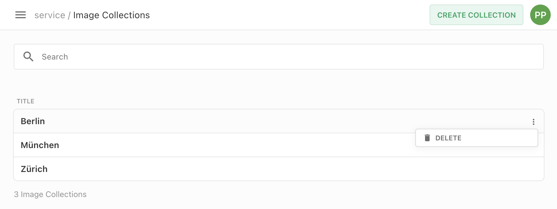
Collections Dashboard
The Image Collections screen lists all collections in the project, sorted alphabetically by title. Editors can search collections by name.
From this screen, editors can:
- Create a new collection: clicking the create button opens a dialog where a unique title must be entered.
- Open a collection: clicking on a collection card opens the collection detail page.
- Delete a collection: the context menu on each card provides a delete option.
Inside a Collection
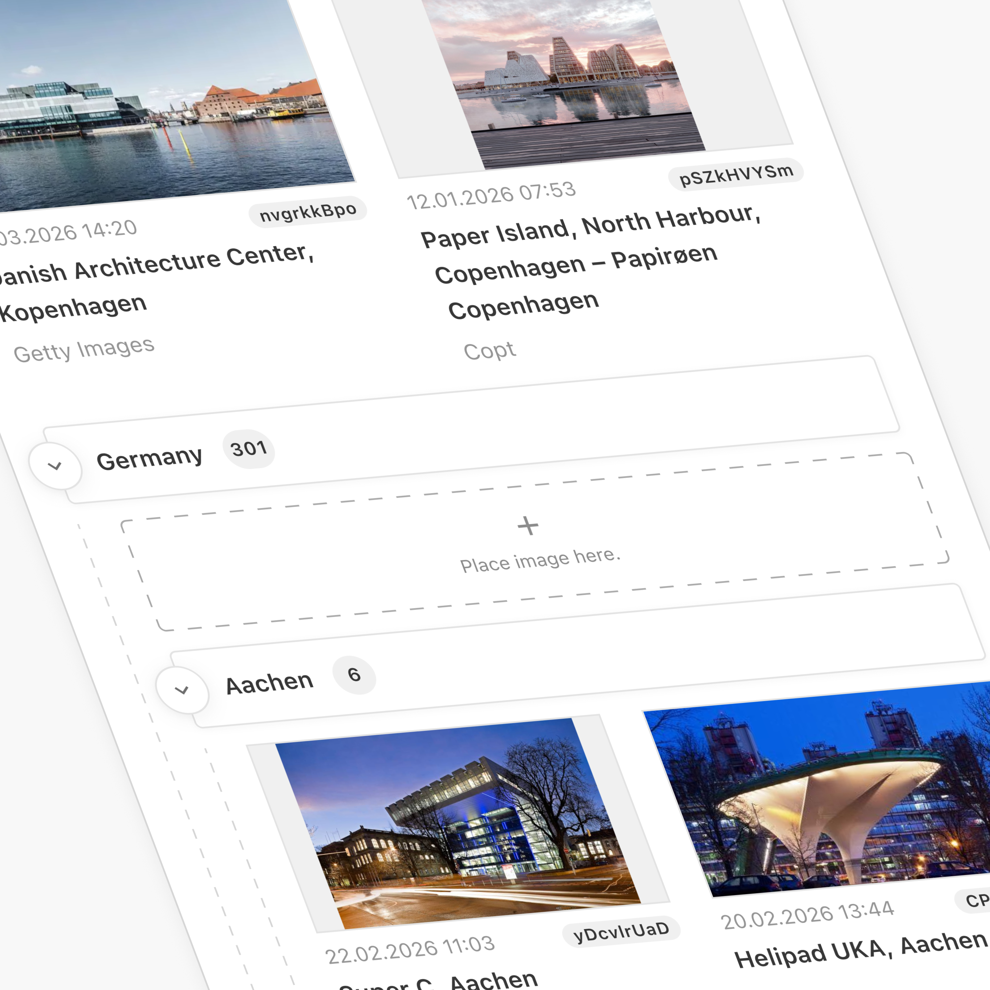
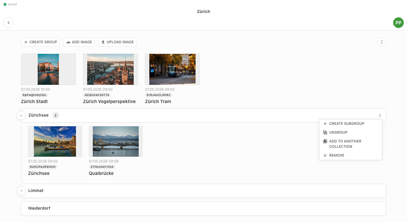
Each collection has its own page. It is built on the same component as the Document Inbox, configured for images only and extended with collection-specific actions. A collection displays its images in a grid and supports the following:
Adding images: Clicking the “Add image” button opens a dialog with multiple tabs. A “Collections” tab for browsing existing collections and selecting an image. The other tabs are either configured Media Library Dashboards or a general media library feed tab.
Uploading Images via drag and drop or upload button: Images can be directly uploaded to an Image Collection and are automatically added to the Media Library. If multiple media types are configured for image collections, users are prompted to select a media type on upload. One or more images can be dragged and dropped into a collection, either into a specific group or the collection root, from the file system or an external source. Alternatively, use the Upload image button.
Multi-selecting and performing batch actions:
Similar to the Media Library, each image in a collection has a context menu with actions: add to another collection, send to inbox, store or remove it from the archive (use2025behavior required), or remove it from the collection.
It is also possible to open the detail view of each image to edit its metadata.
You can select multiple images and apply any of these actions in a single batch operation.
To multiselect multiple images, hold down the Shift key and use the arrow keys, or hold down the Command key (Mac) / Ctrl key (Windows) and click on the desired elements.
Press Escape to clear the selection.
When at least two elements are selected, the batch action pill appears at the bottom of the screen.
Organising with groups: Images within a collection can be organised into collapsible groups using the “Create group” button. Groups help structure large collections. They can be collapsed and expanded individually, or all at once using the toolbar controls. Groups can be nested up to 6 levels deep. A group can be removed (ungrouped) while keeping its images in the collection, which are moved back to the top level of the collection.
Moving content to another collection: Both individual images and entire groups can be added to a different collection via their context menu. This opens the collection picker dialog, which shows breadcrumbs when navigating inside a collection.
Adding Images to Collections from Anywhere
Any image visible in a media library dashboard can be added to a collection without opening the collection first.
Select one or more images, then use the “Add to collection” action in the context menu / batch action menu. This opens the collection picker dialog where the target collection (and optionally a group within it) can be chosen.
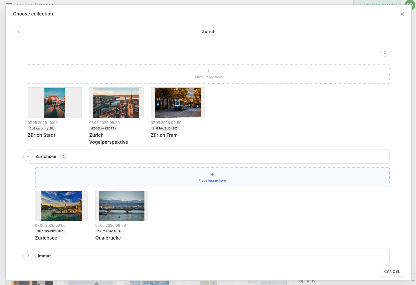
Picking Images from Collections in the Editor
When selecting an image for a metadata field or for an image component in the document editor, the media library picker shows a Collections tab alongside the standard media library feed. Editors can switch to that tab, browse their collections, and pick an image directly from within a collection.
Constraints
- Image Collections only support media types of type
mediaImage. Video and file types cannot be added to a collection. - Only one Image Collections screen can be configured per project.
- Collection titles must be unique within the project.
- The
liImageCollectioncontent type is fully managed by Livingdocs and cannot be customised (e.g. no custom metadata can be added to it).