---
title: Media Library
description: In-depth guide to the media library
---
Livingdocs offers Media Library dashboards which allow to manage and deliver Images, Videos and Files.
There are different pieces that can be used to cover custom needs per project.
This guide will walk you through setting up a basic Media Library for your project with Images, Videos or File support, you will learn about some details along the way.
At heart, the Media Library is based around configured `Media Types`. You might be familiar already with the concept of `Content Types`. `Media Types` are very similar.
You can configure as many different `Media Types` as you want. You want to have at least one for Images - if you don't define one yourself, there is one added automatically at runtime.
See the [mediaType reference](/reference/project-config/media-types/llms.txt) for a full reference of the `mediaType` configuration options.
When you have configured mediaTypes, you will get buttons to let users insert `Images`, `Videos` and `Files` from the Document Editing Toolbar automatically.
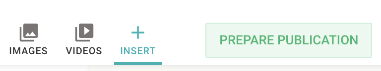
When users click these buttons, the Media Library opens in the sidepanel of the document editor.
Alternatively, they can open the Media Library from the main navigation.
To make the Media Library available there and to control its appearance, which items are displayed, and which filters are available, you need to configure a Media Library Dashboard.
## Media Library Dashboard Configuration
Since release [release-2026-01](/operations/releases/release-2026-01/llms.txt#media-library-dashboards), media libraries can be defined as custom dashboards.
Below you can see an example configuration.
```js
// In editorSettings
dashboards: [
{
type: 'mediaLibraryDashboard', // Required
handle: 'myMediaLibraryDashboard', // Required, must be unique
assetType: 'mediaImage', // Required: Finds available mediaTypes when not filtered by baseFilters
pageTitle: 'Images', // Optional, sets the title in the top toolbar, defaults to a generic title for the mediaType
baseFilters: [{key: 'mediaType', term: ['image1', 'image2']}], // Optional: Invisible base filters applied to every search (including the default result list)
displayFilters: [{filterName: 'liDateTimeRange'}], // Optional: Filters shown to the user below the search input
sort: 'updated_at', // Optional: Defaults to 'updated_at'
useCard: 'myImageCard' // Optional: References an existing DashboardCardConfiguration
}
]
```
When you have created all Media Library dashboards you need, you can add them to the main navigation to make them available there.
This works the same way as any other custom dashboard ([how to add a custom dashboard to the `mainNavigation`](/reference/project-config/editor-settings/llms.txt#custom-dashboard)).
#### type, handle, baseFilters, displayFilters and sort
Properties `type`, `handle`, `baseFilters`, `displayFilters`, and `sort` are equivalent to other custom dashboards.
You can find more information on those common dashboard properties [in the editor-settings guide](/reference/project-config/editor-settings/llms.txt#common-dashboard-properties).
#### assetType
Must be one of `mediaImage`, `mediaVideo` or `mediaFile`.
It retrieves all available mediaTypes that have this assetType defined as their `type` property, unless they are filtered by a baseFilter with `key: 'mediaType'`.
#### useCard
You can reference an existing dashboard card, which will be used to render the media element within a dashboard.
To do so, add the card’s handle here. ([Read more about dashboard cards](/reference/project-config/editor-settings/llms.txt#dashboard-cards))
> [!NOTE]
> **Legacy Media Library Configuration**
>
> Before [release-2026-01](/operations/releases/release-2026-01/llms.txt#media-library-dashboards), it was only possible to have a single Media Library per media category: Images, Videos, and Files.
> The [Main Navigation](/reference/project-config/editor-settings/llms.txt#main-navigation) automatically included entries for Images, Videos, and Files when a `liItem: 'mediaLibrary'` entry was present in the `mainNavigation` configuration and at least one corresponding Media Type existed.
> Both [Base Filters](/customising/advanced/editor-configuration/base-filter/llms.txt) and [Display Filters](/customising/advanced/editor-configuration/display-filter/llms.txt) were defined on the Media Type ([legacy example](/reference/project-config/media-type-example-legacy/llms.txt)). They could be defined individually for the Media Library shown in the document editor and for the Media Library accessible via the main navigation.
> This approach has been deprecated in `release-2026-05` and will be removed in `release-2026-11`. We recommend using the new Media Library Dashboard Configuration and referencing configured Media Library dashboards directly on the Content Type via [useDashboard](/reference/project-config/content-types/llms.txt#usedashboard) (see description above).
## 2025 Behavior
A new set of features has been added to the Media Library which can be enabled using an opt-in server config property. To learn more please see the [2025 Behavior](/guides/media-library/2025-behavior/llms.txt) guide.
## Images
### Server Config
First, you need to make sure your Media Library can [store images](/customising/server-configuration/llms.txt#media-library).
### Image Services
To render images in documents, Livingdocs uses so called [Image Services](/guides/media-library/image-services/llms.txt). You need to [configure one in your project](/guides/media-library/image-services/llms.txt#configuring-an-image-service) to make use of images in documents.
### Basic Media Type
Let's setup a `mediaType` for the images first. You add it to your [project config](/reference/project-config/llms.txt) in an array at the top-level property `mediaTypes`.
```js
//media-types/image.js
module.exports = {
handle: 'image', // one mediaImage must have the handle 'image', additional ones can be named as you like
type: 'mediaImage',
info: {
label: 'Images', // used in dashboards generated for this mediaType
description: ''
},
metadata: [
// any metadata configuration as you know it from contentTypes already
{
handle: 'title',
type: 'li-text',
config: {
required: true, // if a metadata property is required, the user will see a form to enter the metadata during upload
requiredErrorMessage: 'Please provide a title',
maxLength: 200,
index: true
}
},
{
handle: 'description',
type: 'li-text',
config: {
index: true
}
},
{
handle: 'credit',
type: 'li-text',
config: {
required: true,
requiredErrorMessage: 'Please provide a source',
index: true
}
},
{
handle: 'namedCrops',
type: 'li-named-crops',
config: {
index: true,
namedCrops: [
{
name: 'mobile',
isOptional: true
},
{
name: 'desktop'
}
]
},
ui: {
label: 'Named Crops'
}
}
]
}
```
> [!NOTE]
> **Media Library Filters:**
> **Legacy Media Type Configuration vs. Dashboard-Based Setup**
>
> Before [release-2026-01](/operations/releases/release-2026-01/llms.txt#media-library-dashboards), Display Filters and Base Filters were defined directly on the Media Type. This approach has been deprecated in `release-2026-05` and will be removed in `release-2026-11`. We recommend configuring the Media Library via a dedicated Media Library Dashboard (see the section above) and referencing that dashboard from the Content Type, which shows your Images/Videos/Files.
> When using this new setup, any Display Filters and Base Filters defined on the Media Type are automatically ignored for _Media Library dashboards opened from the Main Navigation_.
> For _Media Library dashboards opened from the document editor_, Display Filters and Base Filters are instead resolved from the [referenced Media Library dashboard](/reference/project-config/content-types/llms.txt#usedashboard) (`useDashboard`), if one is configured.
> For reference, the legacy configuration is documented here: [Basic Media Type example before release-2026-01](/reference/project-config/media-type-example-legacy/llms.txt).
### IPTC extraction
Since many image files (especially those you get from image agencies) hold metadata defined by the IPTC standard, you want to configure extraction for certain metadata fields, so your users don't have to manually type them.
You do this by adding the `exifExtraction` property to the `mediaType`. See [the list of all IPTC fields](/reference/project-config/media-types/llms.txt#exif-extraction) and how to configure them.
The exif extraction will run when an image is imported through the [Import API](/customising/advanced/import-api/llms.txt) or when a user uploads an image through the UI.
The user has the chance to manually change the extracted Metadata before the image is stored in the Media Library.
It's allowed to have multiple mappings for one `metadataPropertyName`, the first property with content wins.
```js
// media-types/image.js
module.exports = {
handle: 'image',
type: 'mediaImage',
exifExtraction: {
mappings: [
{metadataPropertyName: 'title', field: 'Title'},
{metadataPropertyName: 'description', field: 'Description'},
{metadataPropertyName: 'credit', field: 'Credit Line'}
]
}
}
```
### Named Crops
With Livingocs, you can manage multiple crops per image by using Named Crops. This works as follows:
- You can define the crops associated with an image in the Media Library.
- Users have the ability to edit these crops during the upload process or directly from the Media Library management dashboard.
- Whenever an image is used in a document, the associated crops are duplicated into the document and can be locally modified within the document itself.
We recommend configuring Named Crops using one the following naming schemes:
1. Configure Named Crops with names based on usage, such as `desktop` and `mobile`.
2. Configure Named Crops with aspect ratio names, such as `16:9` and `4:3`.
In this guide, we will be following naming scheme 1.
To get started, first register all Named Crops in the [designSettings](/reference/project-config/design-settings/llms.txt) of the project configuration.
```js
projectConfig.designSettings: {
// ...
namedCrops: [
{
handle: 'mobile',
label: 'Mobile',
description: 'this image will be shown on small screens',
// on small screens, having exact same ratios across all images is not that important
// we let the user pick one but change freely
recommendedRatios: ['1:1', '16:9']
},
{
handle: 'desktop',
label: 'Desktop',
description: 'this image will be shown on wide screens',
// for large screens, we want consistent 16:9 image ratios, the user can't change that
imageRatios: ['16:9']
},
{
handle: 'sm-teaser',
label: 'SM Teaser',
description: 'this image will be shown on wide screens',
// for social media, we might want to use a different crop, but the ratio is fixed
imageRatios: ['16:9']
}
],
// ...
}
```
Subsequently, you can reference and enable them on image directives and image metadata properties. Specifically, Livingdocs supports Named Crops in three places:
1. On media types with `li-named-crops`.
2. On image directives with `doc-image`.
3. On metadata properties with `li-image`.
Each of these use cases will be covered in the remainder of this section.
#### Media Types
In order to define default crops for images in the Media Library, you must configure a metadata property of type `li-named-crops`. This plugin enables users to set crops during image upload and subsequently within the Media Library.
The default crops are automatically copied into documents when an image is inserted (technically copied to a `doc-image` directive). This allows users to modify the crops for the specific usage of the image within the document. It's important to note that changes to the crops in the Media Library won't affect the usages in `doc-image` once the crops have been copied.
To specify which default crops to store in the Media Library, you must configure a metadata property of type `li-named-crops` within the metadata config of a `mediaType` of type `mediaImage`. The crops support the following configuration properties:
- `name`: Corresponds to the `handle` of the registered Named Crop.
- `isOptional`: Allows the crop to be set optionally.
```js
// media-types/image.js
module.exports = {
handle: 'image',
type: 'mediaImage',
// ...
metadata: [
// ...
{
handle: 'namedCrops',
type: 'li-named-crops',
config: {
// configure all the namedCrops defined in the designSettings
// that you want to keep a default within every mediaLibrary image for
namedCrops: [
{
// the mobile crop is optional, the user can add it at will
name: 'mobile', // name references the handle of a namedCrop in the designSettings
isOptional: true
},
{
// the desktop crop will always be defined after upload
// the user can't remove it but only change according to the
// configuration in the designSettings
name: 'desktop'
},
{
name: 'sm-teaser',
isOptional: true
}
]
},
ui: {
label: 'Named Crops'
}
}
]
// ...
}
```
#### Image Directives
Named Crops specified on image directives `doc-image` define the crops of images embedded in documents. They inherit already defined crops from Media Types, as discussed before.
You can configure crops on image directives in `namedCrops` in the [doc-image](/reference/document/document-design/directives/image/llms.txt) directive of the image component in the [design](/reference/document/document-design/llms.txt). They support the following configuration properties:
- `name`: Corresponds to the `handle` of the registered Named Crop.
- `isDefault`: Sets this crop as the main crop in `component.content.${directiveName}.crop`. As a result, it is rendered as the image preview in the editor. Only one crop per image directive can be marked as the default, and it cannot simultaneously be marked as `isOptional`.
- `isOptional`: Allows the crop to be set optionally.
- `isDefaultIfSet`: If the crop is defined, it overrides the default crop by setting it as the main crop in `component.content.${directiveName}.crop`. As a result, it is rendered as the image preview in the editor.
```js
module.exports = {
name: 'image',
label: 'Image',
iconUrl: `https://livingdocs-assets.s3.amazonaws.com/magazine-design/assets/images/icons-components/icon_image.svg`,
directives: [
{
name: 'image',
type: 'image',
// for images in documents, only the desktop and mobile namedCrops
// are used, the desktop is the default (shown in the document)
// the mobile crop can be added by a user at will
namedCrops: [
// the name references the handle of a namedCrop in the designSettings
{name: 'desktop', isDefault: true},
{name: 'mobile', isOptional: true, isDefaultIfSet: true}
]
}
],
html: dedent`
`
}
```
#### Metadata Properties
Lastly, Named Crops can also be configured on metadata properties of type `li-image`. These properties also inherit previously defined crops from Media Types. A potential use case for such metadata images could be defining teaser images or social media share images.
The configuration is found in the metadata configuration of a [contentType](/reference/project-config/content-types/llms.txt). The crops support the following configuration properties:
- `name`: Corresponds to the `handle` of the registered Named Crop.
- `isOptional`: Allows the crop to be set optionally.
```js
module.exports = {
handle: 'regular',
documentType: 'article',
// ...
metadata: [
// ...
{
handle: 'teaserImage',
type: 'li-image',
config: {
namedCrops: [{name: 'desktop'}, {name: 'mobile', isOptional: true}]
}
},
{
handle: 'socialMediaTeaserImage',
type: 'li-image',
config: {
namedCrops: [{name: 'socialMediaTeaser'}]
}
}
// ...
]
// ...
}
```
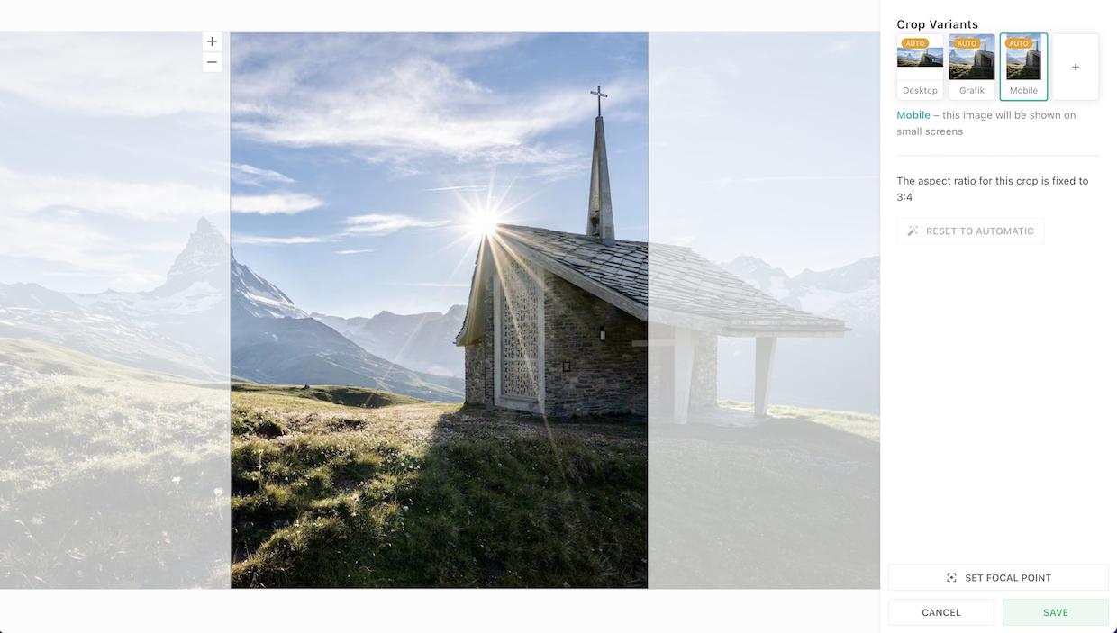
### Focal Point Cropping
Focal point selection is supported on [`li-named-crops`](/reference/document/metadata/plugins/li-named-crops/llms.txt) and [`li-image`](/reference/document/metadata/plugins/li-image/llms.txt) whenever multiple crops are present.
#### Where automatic cropping struggles
Each crop starts with an automatic crop, choosing the default aspect ratio. This does not always lead to ideal results.
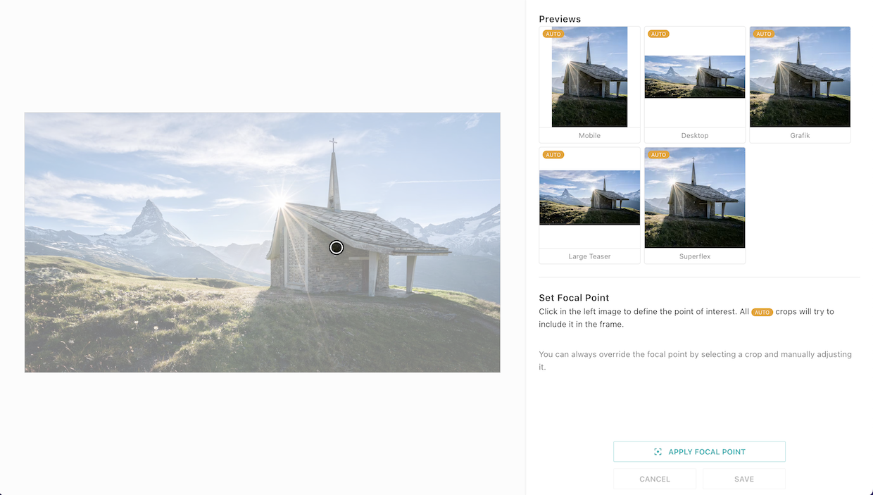
This image of a chapel in front of the famous Matterhorn in the swiss alps is a good example where automatic crops would normally struggle.
The _Mobile_ crop defines an upright aspect ratio of 3:4. By default, the 3:4 crop is centered within the original image.
But in this case, it cuts off both subjects.
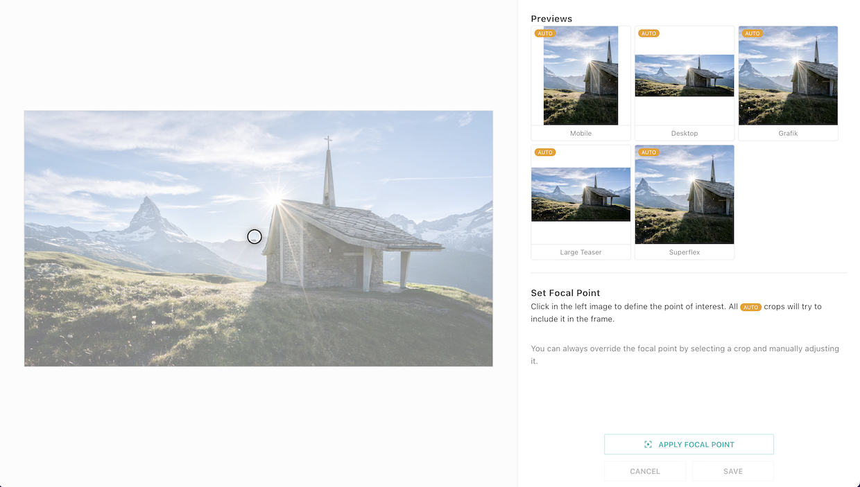
#### Focal Point Mode
With the cropping tool opened, click on _Set Focal Point_ to go into focal point selection mode.
In this mode, all possible crops are showing a live preview on the right side, also those that where not yet added in the previous view.
On the left side, the original image is shown with slightly faded colors and a circle indicating the current focal point position.
By default, the focal point is the center of the image. This is also true if the focal point is not defined at all.
#### Changing the Focal Point
Let's say we'd like the _Matterhorn_ to be our main subject in this image.
While in focal point mode, click on the subject inside the left image to update the focal point.
Notice how the previews on the right side are updated. The 3:4 _Mobile_ crop looks a lot better now.
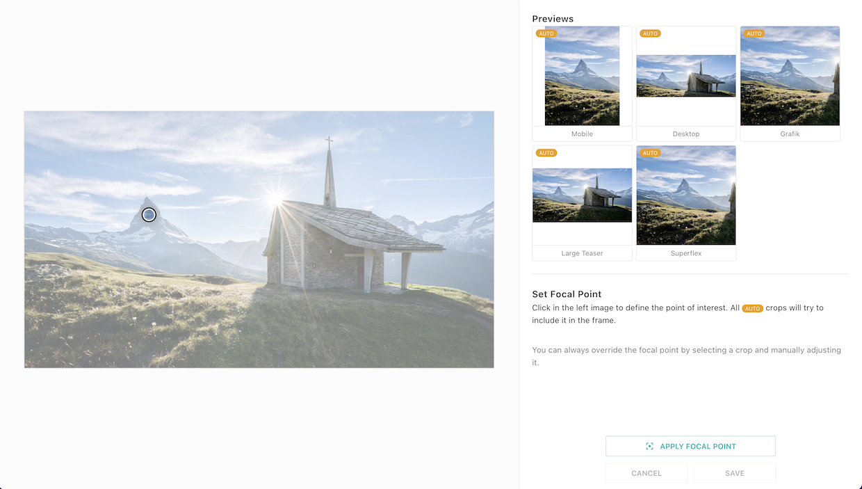
We changed our mind and we'd like to put the focal point on the nice chapel.
Just click on it and observe how the previews are changing.
For best results, use the previews to fine-tune the focal point by making slight adjustments.
#### Apply the Focal Point
Once you're happy with the previews, click on _Apply Focal Point_.
This will bring you back to the normal crop view.
**Hint**: After you've made changes to the focal point, don't forget to click on _Save_.
When clicking on cancel or closing the window without saving, focal point changes are lost.
#### Backwards Compatibility
Focal point cropping is fully backwards compatible and does not need or have any configuration.
Images can now have a `focalPoint` property with `x` and `y` coordinates.
However, each image starts with no focal point defined.
It will only be set if a user explicitly selected a focal point.
In all other cases, the automatic crop calculation falls back to the center crop as it was before `release_2022-11`.
## Videos
Videos work in a similar way to images. The solution still has some shortcomings you need to be aware of:
- No render strategies or video services like you know them from images are available yet. That means the system works well if you render from the JSON in the delivery, but not so well if you let Livingdocs do the rendering to HTML.
- As with images, you don't want to deliver the original Video file to your customers directly but have some kind of transcoding to different formats and sizes. There is no integrated solution to this in Livingdocs yet.
Nevertheless if you find solutions to these problems outside of Livingdocs, you can very well make use of the Video Management System already.
### Server Config
You need to make sure your Media Library can [store videos](/customising/server-configuration/llms.txt#media-library).
### Basic Media Type
Let's setup a `mediaType` for the videos. You add it to your [project config](/reference/project-config/llms.txt) in an array at the top-level property `mediaTypes`.
```js
//media-types/video.js
module.exports = {
handle: 'video', // one mediaVideo must have the handle 'video', additional ones can be named as you like
type: 'mediaVideo',
info: {
label: 'Videos', // used in dashboards generated for this mediaType
description: ''
},
metadata: [
// any metadata configuration as you know it from contentTypes already
{
handle: 'title',
type: 'li-text',
config: {
required: true, // if a metadata property is required, the user will see a form to enter the metadata during upload
requiredErrorMessage: 'Please provide a title',
maxLength: 200,
index: true
}
},
{
handle: 'description',
type: 'li-text',
config: {
index: true
}
},
{
handle: 'credit',
type: 'li-text',
config: {
required: true,
requiredErrorMessage: 'Please provide a source',
index: true
}
}
],
editor: {
// Deprecated since release-2026-05, will be removed in release-2026-11.
// Use useDashboard on the content type instead.
dashboard: {
displayFilters: [{filterName: 'liDateTimeRange'}]
},
// the dashboard opened through the main navigation
managementDashboard: {
displayFilters: [{filterName: 'liDateTimeRange'}]
}
}
}
```
### Poster Image
For Videos, you want to have a poster image displayed in your Video Player before the Video starts playing. Livingdocs provides a metadata plugin to manage this image.
When configured, a UI to manage the image is provided.

You can even select a specific frame of the video by pausing the player and selecting the current frame as the poster image.
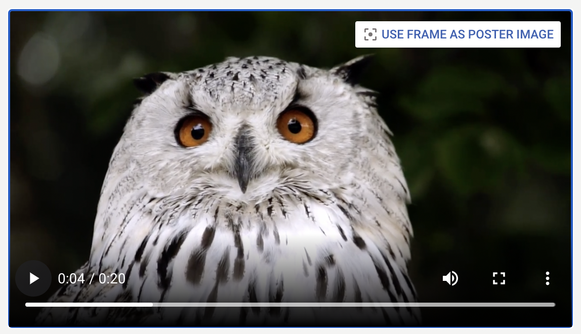
Images stored with this metadata plugin will contain one crop in the aspect ratio of the video file automatically. A user can change the zoom and position but not the aspect ratio of that crop.
Poster Images are stored withing the Media Library as images when uploaded through the poster image metadata plugin or a frame of the video is selected. You probably want to configure a separate `mediaType` for these, since there are different requirements to the metadata.
#### mediaType for the images
Don't forget to add this the the `mediaTypes` in your [project config](/reference/project-config/llms.txt).
```js
// /media-types/poster-image.js
module.exports = {
handle: 'posterImage',
type: 'mediaImage',
info: {
label: 'Poster Images'
},
hidden: true, // Deprecated since release-2026-05, will be removed in release-2026-11
metadata: [
{
handle: 'title',
type: 'li-text'
}
]
}
```
#### li-poster-image metadata plugin
Now you can add the `li-poster-image` metadata plugin to your video `mediaType`:
```js
//media-types/video.js
module.exports = {
handle: 'video',
type: 'mediaVideo',
// ...
metadata: [
// ...
{
handle: 'posterImage',
type: 'li-poster-image',
ui: {
config: {
uploadMediaType: 'posterImage' // this is the handle of the mediaType used for uploaded images
}
}
}
]
// ...
}
```
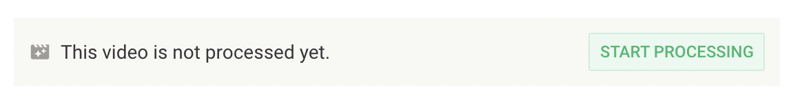
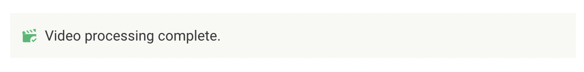
### External Transcoding Service
A Transcoding Service can be used to convert a Video into different formats and resolutions.
Livingdocs lets you connect to an external Transcoding Service using a metadata plugin that
manages the transcoding state.
When configured, the transcoding state of a Video is shown in the UI.
Initial state:
After transcoding:
#### li-transcoding-state metadata plugin
Add the `li-transcoding-state` metadata plugin to your video `mediaType`:
```js
//media-types/video.js
module.exports = {
handle: 'video',
type: 'mediaVideo',
// ...
metadata: [
// ...
{
handle: 'transcoding',
type: 'li-transcoding-state'
}
]
// ...
}
```
#### Transcoding Service implementation
An external transcoding service can be connected to Livingdocs as follows:
- Use [webhooks](/reference/webhooks/llms.txt) to get notified about transcoding requests.
- Use the public API (mediaLibrary GET) to fetch information about a transcoding request.
- Use the public API (mediaLibrary PATCH) to update the transcoding state.
This data structure is used to track transcoding state:
```js
{
"metadata": {
"transcoding": {
"commands": [{
"assetKey": "de2bc74bea-3",
"commandId": "1980b544cfc2",
"createdAt": "2021-03-01T12:34:56Z",
// One of ["requested", "acknowledged", "inProgress",
// "done", "error"]
"state": "inProgress",
// optional, 0 - 100
"progress": 42,
// optional
"errorMessage": "Error: Unsupported video resolution."
}],
"transcodings": [{
"assetKey": "de2bc74bea-3",
// Just an example; defined by external system
"versions": [{
"format": "video/mp4",
"url": "https://example.com/example-w500.mp4",
"size": "mobile"
},
{
"format": "video/webm",
"url": "https://example.com/example-w500.webm",
"size": "mobile"
}]
}]
}
}
}
```
Transcoding happens in the following sequence:
- When a user clicks "Start processing", a new `command` with `state: "requested"` is created.
- The transcoding service gets notified via webhook and can report transcoding progress by setting `state` and `progress` / `errorMessage`.
- When transcoding is done, the transcoding service is expected to set `state` to `done` and add an entry to the `transcodings` array.
## Files
You can also manage other files than videos and images with the Livingdocs Media Library as well.
### Server Config
You need to make sure your Media Library can [store files](/customising/server-configuration/llms.txt#media-library).
### Basic Media Type
Let's setup a `mediaType` for the files. You add it to your [project config](/reference/project-config/llms.txt) in an array at the top-level property `mediaTypes`.
```js
//media-types/file.js
module.exports = {
handle: 'file', // one mediaFile must have the handle 'file', additional ones can be named as you like
type: 'mediaFile',
info: {
label: 'Files', // used in dashboards generated for this mediaType
description: ''
},
// any metadata configuration as you know it from contentTypes already
metadata: [
{
handle: 'title',
type: 'li-text',
config: {
required: true, // if a metadata property is required, the user will see a form to enter the metadata during upload
requiredErrorMessage: 'Please provide a title',
maxLength: 200,
index: true
}
},
{
handle: 'description',
type: 'li-text',
config: {
index: true
}
},
{
handle: 'credit',
type: 'li-text',
config: {
required: true,
requiredErrorMessage: 'Please provide a source',
index: true
}
}
]
}
```
## Thumbnail Sizes
Added in: [`release-2026-03`](/operations/releases/release-2026-03/)
When working with image agency feeds, users often need to visually scan through large volumes of images, for example to pick relevant photos from a live coverage event or to identify the start and end of a photo series. The thumbnail size on Media Library Dashboard screens can be adjusted to fit these needs.

Three sizes are available: **Small (S)**, **Medium (M)** and **Large (L)**. The number of columns adjusts based on the screen width and the selected size.
The setting works on Media Library Dashboard screens opened from the main navigation as well as on dashboards within the document editor side panel.
Media Library Dashboard screens use the full available screen width. The detail side panel extends to the right edge. Scrolling through search results works like infinite scrolling without interruptions.
The size setting is stored in local storage and shared across all Media Library Dashboard screens.
## Metadata Translations
First, you have to configure the available languages in the system as [described here](/guides/editor/multi-language-content/llms.txt)
### Add Plugin to Enable Translations
As a next step, you have to add the `li-metadata-translations` metadata plugin to enable the Translations behavior for the media library.
```js
//media-types/image.js
module.exports = {
metadata: [
{
handle: 'language',
type: 'li-metadata-translations'
}
]
}
```
### Translatable metadata properties
Now you can configure any metadata property in a `mediaType` to be translatable by the user like this:
```js
//media-types/image.js
module.exports = {
metadata: [
{
config: {
translatable: true
}
}
]
}
```
### Translatable assets (image/video/file)
If you want to allow users to define different assets per language on a Media Library entry, you have to specifically allow this per `mediaType` like this:
```js
//media-types/image.js
module.exports = {
handle: 'image',
type: 'mediaImage'
// ...
asset: {
// this allows to set another asset per translation once
translatable: true,
// this allows for existing assets to be changed by the user
replaceable: true
},
//...
}
```
#### Caveats
- With [`release-2021-06`](/operations/releases/release-2021-06/), using `li-named-crops` metadata plugin on `mediaImage` types in combination with asset translation has some suboptimal behaviors. This will be improved in a future release.
- Both `translatable` and `replaceable` might need handling in your delivery regarding caching, fallback resolution when rendering different languages etc. You need to be aware of this and find solutions. Setting these assets triggers a `mediaLibraryEntry.update` event on the Events API and the webhooks in the same way as updating the metadata does.
## Usage Log
Added in: [`release-2026-03`](/operations/releases/release-2026-03/)
Customers need to keep track of where and when an image was published for legal reasons and royalty billing. This could be a web article, a print product, a social media post, or a digital edition. Some usages can be directly inferred from their presence in a published Livingdocs document. For publications outside of Livingdocs, usage needs to be tracked separately.
The Usage Log feature is only available when `use2025Behavior` has been enabled. Please read the [2025 Behavior Guide](/guides/media-library/2025-behavior/llms.txt) if you haven't enabled the new functionality yet.
### Enabling the Usage Log feature
Define at least one purpose in the `projectConfig.mediaCenter.usageLog.purposes` array to enable the feature for all media types in the project.
```js
{
mediaCenter: {
usageLog: {
purposes: [
{
handle: 'print',
label: {
en: 'Print',
de: 'Druck'
},
internal: false,
paramsSchema: [
{
handle: 'page',
type: 'li-integer',
ui: {
label: {
en: 'Page',
de: 'Seite'
}
}
}
]
}
]
}
}
}
```
The purposes are displayed to a user when creating or updating a usage log entry, or when downloading a media library entry. Any additional properties defined within the `paramsSchema` array will also be displayed when creating or updating an entry, but not in the download form. To see which metadata plugins are supported please refer to the [Metadata Plugins List](/reference/document/metadata/plugins/llms.txt). We automatically store the reporting date and `userId`, and provide input fields for the publication date, the state ("pending" or "confirmed") and a url.
Usage log purposes can be flagged as internal. When the `internal` property is set to `true` it prevents a user from creating, updating or deleting entries for the purpose within the editor. A read-only entry will still be visible within the UI. This is intended to be used alongside the [`addUsageLogEntriesForMediaInDocument`](#generating-usage-log-entries-on-publish) function to create permanent entries.
### Creating usage log dashboards
It's possible to define dashboards which provide an easy way to review incomplete entries:
```js
{
editorSettings: {
dashboards: [
// Show all media library entries which have a usage log with `state: 'pending'`
{
type: 'mediaLibraryDashboard',
handle: 'pendingMediaUsageLogs',
pageTitle: {en: 'Pending Usage Logs', de: 'Ausstehende Verwendungsnachweise'},
assetType: 'mediaImage',
baseFilters: [{key: 'usageLog.pendingUserIds', exists: true}],
displayFilters: ['timeRange', 'pendingMediaUsageLogs']
},
// Show media library entries which have a usage log with `state: 'pending'` for the current user
{
type: 'mediaLibraryDashboard',
handle: 'myPendingMediaUsageLogs',
pageTitle: {en: 'My Pending Usage Logs', de: 'Meine ausstehenden Verwendungsnachweise'},
assetType: 'mediaImage',
baseFilters: [{key: 'usageLog.pendingUserIds', termPattern: '{{ userId }}'}],
displayFilters: ['timeRange']
}
]
}
}
```
As usual, add a dashboard entry to `mainNavigation` which points to the handle defined and assign this to the correct position within `mainNavigationGroups`.
### Custom usage log display filter
Another option to see media library entries with pending usage logs is to create a display filter which can be added to an existing media library dashboard:
```js
liEditor.searchFilters.registerListV2('pendingMediaUsageLogs', {
label: {
en: 'Pending usage logs',
de: 'Ausstehende Verwendungsnachweise'
},
datasource: {
fetch({access, config, dashboard}) {
// Allow all users to see media library entries with their own pending usage logs
const options = [
{
label: {
en: 'My pending usage logs',
de: 'Meine ausstehenden Verwendungsnachweise'
},
filter: {key: 'usageLog.pendingUserIds', termPattern: '{{ userId }}'},
isDefault: config.showMyLogsByDefault
}
]
// Allow users with write permissions to see all media library entries with pending usage logs
const showAllOption = !!dashboard.mediaTypes?.every((mt) =>
access.allowed('mediaLibraryEntry.update', {mediaType: mt})
)
if (showAllOption) {
options.push({
label: {
en: 'All pending usage logs',
de: 'Alle ausstehenden Verwendungsnachweise'
},
filter: {key: 'usageLog.pendingUserIds', exists: true},
isDefault: config.showAllLogsByDefault
})
}
return options
}
}
})
```
### Generating usage log entries on publish
The function `mediaLibraryApi.addUsageLogEntriesForMediaInDocument()` can be used to easily create usage log entries. This function is intended to be used in a post publish hook and will add usage log entries for any referenced media library entries which do not already have a usage log entry for the document provided. The entry will automatically be marked as 'confimed' so any mandatory params must be provided.
```js
liServer.registerInitializedHook(() => {
const mediaLibraryApi = liServer.features.api('li-media-library')
liServer.registerPublicationHooks({
async postPublishHookAsync({documentVersion}) {
await mediaLibraryApi.addUsageLogEntriesForMediaInDocument({
documentVersion,
purpose: 'web',
url: `https://example.com/my-slug-${documentVersion.id}`, // Optional
params: {medium: 'Internet'} // Required params mandatory
})
}
})
})
```