---
title: Document Design
---
The document design is defined by 2 top-level properties:
```js
designSettings: {...},
components: {...}
```
The components define the building blocks out of which you can create your documents. They are basically small HTML templates for things like paragraphs, images or embeds.
The design settings define global design properties like the CSS to use or how components are grouped together.
> [!NOTE]
> As of [`release-2025-03`](/operations/releases/release-2025-03/), documents are delivered with the newest design version. Ensure that any design changes are accompanied by the corresponding [On-Read Migrations](/reference/document/migration/on-read-migration/llms.txt).
## Video Guide
Intro to how Livingdocs components work and how to apply a design change to your project.
[Watch video on Vimeo](https://vimeo.com/429647905)
## Components
### Component Declaration
Components are the building blocks of Livingdocs documents. In essence a component is a combination of an HTML template with declarative Livingdocs directive attributes (`doc-` directives) and a JSON with configuration for those directives.
```js
name: 'p',
label: 'Paragraph',
iconUrl: 'https://livingdocs-assets.s3.amazonaws.com/magazine-design/assets/images/icons-components/icon_text.svg',
directives: [
{
name: 'p',
type: 'editable',
plainText: true
}
],
html: '\n Paragraph\n
'
```
The above component definition will render a paragraph with editable text. Only plaintext is allowed in this text.
### Component Properties
- `allowedParents`, array of strings, defines in which components that have container directives (you must give the component name) this component may be added
- `excludeFromTextCount`, true | false, if true no editable directives in this component are counted towards the document text count
- `properties`, array of strings, references to component properties (see above) that should be shown in the properties panel if this component is selected in the editor
- `iconUrl`
- option 1: string, fully specified URL to an SVG icon that is displayed for this component in the editors sidebar
- option 2: string, base64 encoded SVG data url that is displayed for this component in the editors sidebar
- `label`, string, the title that this component has
- `description`, string, a descriptive text for this component
- `name`, string, the system name of this component
### Component Directives
Livingdocs supports the following directive types.
| Type | Description |
| :-------- | :------------------------------------------------------------------------------------------------------------------------------------------------------------------------- |
| editable | The content of this tag is editable text by the user. [details](/reference/document/document-design/directives/editable/llms.txt) |
| image | The user can select and image that is set as a `src` attribute on `![]() ` tags and as `background-image` style on other tags. [details](/reference/document/document-design/directives/image/llms.txt) |
| container | This tag can contain other components. [details](/reference/document/document-design/directives/container/llms.txt) |
| link | The href attribute of this tag can be set to a link by the user. [details](/reference/document/document-design/directives/link/llms.txt) |
| include | Inside of this tag, a remote micro service will render an edge-side include of the given type. [details](/reference/document/document-design/directives/include/llms.txt) |
| html | The content of this tag is freeform HTML. This can be used to embed tweets or IFrames. [details](/reference/document/document-design/directives/html/llms.txt) |
| style | Allows a user to set the `style` attribute on a DOM node [details](/reference/document/document-design/directives/style/llms.txt) |
For the declaration in HTML always prepend `doc-` to the type.
### Example With Multiple Components
An example:
```js
// projectConfig.designSettings:
components: [
{
name: 'title',
label: 'Title',
iconUrl: 'https://livingdocs-assets.s3.amazonaws.com/magazine-design/assets/images/icons-components/icon_header_simple.svg',
directives: [
{
type: 'editable',
name: 'title',
maxLength: 5
}
],
html: '
` tags and as `background-image` style on other tags. [details](/reference/document/document-design/directives/image/llms.txt) |
| container | This tag can contain other components. [details](/reference/document/document-design/directives/container/llms.txt) |
| link | The href attribute of this tag can be set to a link by the user. [details](/reference/document/document-design/directives/link/llms.txt) |
| include | Inside of this tag, a remote micro service will render an edge-side include of the given type. [details](/reference/document/document-design/directives/include/llms.txt) |
| html | The content of this tag is freeform HTML. This can be used to embed tweets or IFrames. [details](/reference/document/document-design/directives/html/llms.txt) |
| style | Allows a user to set the `style` attribute on a DOM node [details](/reference/document/document-design/directives/style/llms.txt) |
For the declaration in HTML always prepend `doc-` to the type.
### Example With Multiple Components
An example:
```js
// projectConfig.designSettings:
components: [
{
name: 'title',
label: 'Title',
iconUrl: 'https://livingdocs-assets.s3.amazonaws.com/magazine-design/assets/images/icons-components/icon_header_simple.svg',
directives: [
{
type: 'editable',
name: 'title',
maxLength: 5
}
],
html: '\n Title\n
'
},
{
name: "p",
label: "Paragraph",
iconUrl: 'https://livingdocs-assets.s3.amazonaws.com/magazine-design/assets/images/icons-components/icon_text.svg',
html: '\n Paragraph\n
'
},
{
name: "image",
label: "Bild",
iconUrl: 'https://livingdocs-assets.s3.amazonaws.com/magazine-design/assets/images/icons-components/icon_image.svg',
directives: [
{
name: 'image',
type: 'image',
allowOriginalRatio: true,
imageRatios: [
'16:9',
'1:1',
'4:3',
'3:4'
]
}
],
html: '\n
\n
![]()
\n
\n
\n
![]() tag
imgTagRenderStrategy: 'srcSet',
// strategy used if doc-image is declared on any other tag
anyTagRenderStrategy: 'backgroundImage',
// configuration for the responsive 'backgroundImage' render strategy
backgroundImage: {
defaultWidth: 1200,
cssVars: {
'mobile-img': 600,
'tablet-img': 900
}
},
// configuration for the 'srcSet' render strategy
srcSet: {
defaultWidth: 1024,
widths: [2048, 1024, 620, 320],
sizes: ['100vw']
},
video: {
controls: true,
loop: false,
autoplay: false,
muted: false,
preload: 'auto'
}
},
componentProperties: [
{
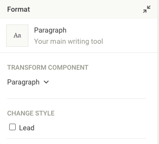
label: 'Lead',
type: 'option',
value: 'paragraph--lead',
name: 'paragraph-style-lead'
},
{
label: 'Background Color',
type: 'style',
cssProperty: 'background-color',
name: 'css-background-color'
}
],
componentGroups: [
{
name: 'text',
label: 'Text',
components: [
title,
p
]
},
{
name: 'media',
label: 'Media',
components: [
image,
insta
]
}
],
defaultComponents: {
paragraph: 'p',
image: 'image',
video: 'video'
},
fieldExtractor: [
{
// metadata handle
identifier: 'title',
// 'text' / 'image' / 'cssProperty'
type: 'text',
// extract from component 'title' the directive 'text'
matches: ['title.text']
}
],
namedCrops: [
{
handle: 'mobile',
label: 'Mobile',
description: 'this image will be shown on small screens',
// recommendedRatios are a suggestion and the user can easily pick on, but can also use a different ratio
recommendedRatios: ['1:1', '16:9']
},
{
handle: 'tablet',
label: 'Tablet',
description: 'this image will be shown on medium screens',
recommendedRatios: ['16:9']
},
{
handle: 'desktop',
label: 'Desktop',
description: 'this image will be shown on wide screens',
// imageRatios are enforced, the user has to pick one of them, the first is the default
imageRatios: ['21:9', '16:9']
},
{
handle: 'socialMediaTeaser',
label: 'SM Teaser',
description: 'This image will be used for social media teasers',
// the user won't be able to pick a ratio but can only change the crops position and zoom
imageRatios: ['16:9']
},
{
handle: 'smallTeaser',
label: 'Small Teaser',
description: 'Used for small teasers',
// the user can either stay with the recommended 1:1 ratio or change it freely...
recommendedRatios: ['1:1'],
// ... within the boundaries of minRatio and maxRatio (the factor is the ratio, think 16/9 = 1.7777)
minRatio: 0.25,
maxRatio: 3
},
{
handle: 'largeTeaser',
label: 'Large Teaser',
description: 'Used for large teasers',
// the user can stay with 16:9 or change the ratio freely...
recommendedRatios: ['16:9'],
// ...as long as the resulting image contains at least 300 * 300 pixels (width * height)
minResolution: 300 * 300
}
]
},
```
### Assets
Livingdocs uses CSS and possible JS assets to render documents. The `assets` object contains 2 keys, `css` and `js`, both of which are arrays and contain fully specified URLs to your CSS and JS files respectively. We advise you to upload the files to an AWS S3 bucket or similar and link them.
### Image Rendering
The image rendering configuration tells Livingdocs how to render
images in your components.
In general the image rendering configs or part of them
can be overwritten in components so you can e.g. have different
`srcSet` settings for an individual component or use a different image
render strategy altogether.
##### `imgTagRenderStrategy`
Default: 'srcSet'
Available: ['srcSet', 'resrc.it', 'src']
Strategy used if `doc-image` is declared on an `
tag
imgTagRenderStrategy: 'srcSet',
// strategy used if doc-image is declared on any other tag
anyTagRenderStrategy: 'backgroundImage',
// configuration for the responsive 'backgroundImage' render strategy
backgroundImage: {
defaultWidth: 1200,
cssVars: {
'mobile-img': 600,
'tablet-img': 900
}
},
// configuration for the 'srcSet' render strategy
srcSet: {
defaultWidth: 1024,
widths: [2048, 1024, 620, 320],
sizes: ['100vw']
},
video: {
controls: true,
loop: false,
autoplay: false,
muted: false,
preload: 'auto'
}
},
componentProperties: [
{
label: 'Lead',
type: 'option',
value: 'paragraph--lead',
name: 'paragraph-style-lead'
},
{
label: 'Background Color',
type: 'style',
cssProperty: 'background-color',
name: 'css-background-color'
}
],
componentGroups: [
{
name: 'text',
label: 'Text',
components: [
title,
p
]
},
{
name: 'media',
label: 'Media',
components: [
image,
insta
]
}
],
defaultComponents: {
paragraph: 'p',
image: 'image',
video: 'video'
},
fieldExtractor: [
{
// metadata handle
identifier: 'title',
// 'text' / 'image' / 'cssProperty'
type: 'text',
// extract from component 'title' the directive 'text'
matches: ['title.text']
}
],
namedCrops: [
{
handle: 'mobile',
label: 'Mobile',
description: 'this image will be shown on small screens',
// recommendedRatios are a suggestion and the user can easily pick on, but can also use a different ratio
recommendedRatios: ['1:1', '16:9']
},
{
handle: 'tablet',
label: 'Tablet',
description: 'this image will be shown on medium screens',
recommendedRatios: ['16:9']
},
{
handle: 'desktop',
label: 'Desktop',
description: 'this image will be shown on wide screens',
// imageRatios are enforced, the user has to pick one of them, the first is the default
imageRatios: ['21:9', '16:9']
},
{
handle: 'socialMediaTeaser',
label: 'SM Teaser',
description: 'This image will be used for social media teasers',
// the user won't be able to pick a ratio but can only change the crops position and zoom
imageRatios: ['16:9']
},
{
handle: 'smallTeaser',
label: 'Small Teaser',
description: 'Used for small teasers',
// the user can either stay with the recommended 1:1 ratio or change it freely...
recommendedRatios: ['1:1'],
// ... within the boundaries of minRatio and maxRatio (the factor is the ratio, think 16/9 = 1.7777)
minRatio: 0.25,
maxRatio: 3
},
{
handle: 'largeTeaser',
label: 'Large Teaser',
description: 'Used for large teasers',
// the user can stay with 16:9 or change the ratio freely...
recommendedRatios: ['16:9'],
// ...as long as the resulting image contains at least 300 * 300 pixels (width * height)
minResolution: 300 * 300
}
]
},
```
### Assets
Livingdocs uses CSS and possible JS assets to render documents. The `assets` object contains 2 keys, `css` and `js`, both of which are arrays and contain fully specified URLs to your CSS and JS files respectively. We advise you to upload the files to an AWS S3 bucket or similar and link them.
### Image Rendering
The image rendering configuration tells Livingdocs how to render
images in your components.
In general the image rendering configs or part of them
can be overwritten in components so you can e.g. have different
`srcSet` settings for an individual component or use a different image
render strategy altogether.
##### `imgTagRenderStrategy`
Default: 'srcSet'
Available: ['srcSet', 'resrc.it', 'src']
Strategy used if `doc-image` is declared on an `![]() ` tag.
Example Component where this strategy would be used:
```html
```
##### `anyTagRenderStrategy`
Default: 'backgroundImage'
Available: ['backgroundImage', 'resrc.it']
Strategy used if `doc-image` is declared on an tag except `
` tag.
Example Component where this strategy would be used:
```html
```
##### `anyTagRenderStrategy`
Default: 'backgroundImage'
Available: ['backgroundImage', 'resrc.it']
Strategy used if `doc-image` is declared on an tag except `![]() `.
Example Component where this strategy would be used:
```html
```
##### `srcSet`
Used when the image is rendered with the render strategy 'srcSet'.
For more information about how `srcSet` works in HTML, refer to this article:
https://ericportis.com/posts/2014/srcset-sizes/
Config Example:
```js
// configuration for the 'srcSet' render strategy
srcSet: {
defaultWidth: 1024,
widths: [
1024,
620
],
sizes: ['100vw']
}
```
Example Output:
```html
`.
Example Component where this strategy would be used:
```html
```
##### `srcSet`
Used when the image is rendered with the render strategy 'srcSet'.
For more information about how `srcSet` works in HTML, refer to this article:
https://ericportis.com/posts/2014/srcset-sizes/
Config Example:
```js
// configuration for the 'srcSet' render strategy
srcSet: {
defaultWidth: 1024,
widths: [
1024,
620
],
sizes: ['100vw']
}
```
Example Output:
```html
 ```
#### `backgroundImage`
Used when the image is rendered with the render strategy 'backgroundImage'.
For background images you can simply set a fixed `defaultWidth`, so that each background image will get the corresponding width set. (if the actual width of the image is lower, it will never be interpolated but just left at its original size).
Config Example:
```js
// Example config for a responsive 'backgroundImage' rendering
backgroundImage: {
defaultWidth: 1200,
cssVars: {
'mobile-img': 600
}
}
```
Example Output:
```html
```
Example CSS to make it work:
```css
@media (max-width: 768px) {
.hero-background {
background-image: var(--mobile-img) !important;
}
}
```
#### `src`
Needs no configuration. Only available for `img` tags.
Example Output:
```html
```
#### `backgroundImage`
Used when the image is rendered with the render strategy 'backgroundImage'.
For background images you can simply set a fixed `defaultWidth`, so that each background image will get the corresponding width set. (if the actual width of the image is lower, it will never be interpolated but just left at its original size).
Config Example:
```js
// Example config for a responsive 'backgroundImage' rendering
backgroundImage: {
defaultWidth: 1200,
cssVars: {
'mobile-img': 600
}
}
```
Example Output:
```html
```
Example CSS to make it work:
```css
@media (max-width: 768px) {
.hero-background {
background-image: var(--mobile-img) !important;
}
}
```
#### `src`
Needs no configuration. Only available for `img` tags.
Example Output:
```html
 ```
#### `resrc.it`
Works both for `
```
#### `resrc.it`
Works both for `![]() ` tags as well as for other tags.
Example Output:
```html
` tags as well as for other tags.
Example Output:
```html
![]() ```
#### Overwriting config in a Component Directive
```js
// Can overwrite design config.
// Here an example for a responsive background image:
directives: {
image: {
type: 'image',
renderStrategy: 'backgroundImage',
backgroundImage: {
defaultWidth: 1200
cssVars: {
'mobile-img': 600,
'tablet-img': 900
}
}
}
}
```
Via the property `renderStrategy` a renderStrategy can be explicitly defined.
The `backgroundImage` config in this example is of the same structure as
it is in the `mediaRendering` property of the `designSettings`.
### Component Properties
Component properties give users of the Livingdocs editor easy styling options for components. There are three types of properties:
- `option`, turns a style (css class) on or off
- `select`, select from a set of css classes
- `style`, in tandem with [doc-style directives](/reference/document/document-design/directives/style/llms.txt), sets the `style` attribute of a tag
The `value` in case of option or select contains a CSS class from your CSS asset files.
The schema looks as follows.
```js
componentProperties: ms.arrayOf(
ms.allOf([
{
if: ms.obj({type: ms.const('option')}),
then: ms.strictObj({
type: ms.required.enum('option'),
name: 'string:required',
label: 'string',
value: 'string:required'
})
},
{
if: ms.obj({type: ms.const('select')}),
then: ms.strictObj({
type: ms.required.enum('select'),
name: 'string:required',
label: 'string',
// must contain one empty option
options: ms.required.arrayOf(
ms.strictObj({
caption: 'string:required',
value: 'string'
})
)
})
},
{
if: ms.obj({type: ms.const('style')}),
then: ms.strictObj({
type: ms.required.enum('style'),
name: 'string:required',
label: 'string',
cssProperty: 'string:required'
})
}
])
)
```
### Component Groups
With component groups you can visually group together similar components, e.g. "Text components" for use in the Livingdocs editor sidebar.
### Default Components
Livingdocs knows 3 types of default components:
- `paragraph`, automatic insert when a user presses "Enter" in the editor, typically a p tag
- `image`, automatic insert when a user drags an image to Livingdocs, e.g. from the Desktop
- `video`, automatic insert when a user drags a video to Livingdocs, e.g. from the Desktop
You have to configure the handle of the respective component that should be inserted.
### Field Extractor
The field extractor allows you to one way synchronising metadata fields with values from the document. As long as the metadata field is not overwritten manually, the sync is active. A common use case is to use the document title in a metadata field `title`.
**Example**
```js
fieldExtractor: [
{
identifier: 'title',
type: 'text',
matches: ['title.title']
}
]
```
By default the field extractor is not enabled for pages. You can configure it in the global editor config with the following field in the metadata object:
```
metadata: {
fieldExtractorOnPage: true
}
```
**Properties**
- `identifier` - metadata field handle, you want to sync to
- `type` data type
- `text` for `doc-editable` directives
- `image` for `doc-image`
- `cssProperty` for `doc-style`
- Other design directives are currently not supported.
- `matches` defines an array of component.directive pairs from which the content should be synced into the metadata field. E.g. for a component named "title" that has a doc-editable directive "title", you would write "title.title". When `type` is set to `cssProperty` one can define which CSS property to extract, e.g. `color`.
### Component Prefilling
Livingdocs supports two types of component prefilling; author and author-email. Components with an `author` directive can have the author or their email automatically filled. If these components are in the default content of an document type they are prefilled on document creation and are also prefilled when new components are dragged from the insert panel. This is only supported in the editor and not for document import.
You can enable Prefilled Components by adding them to the Design Settings:
```js
{
v: 2,
...
designSettings: {
prefilledComponents: [{
component: 'title',
content: [{
directive: 'author',
value: 'author', // can be 'author' or 'author-email'
type: 'computed'
}]
}]
}
}
```
As a second step you have to add a Design Component `title` which contains a directive `author`. After that, when you add the `title` component to a document, or it is in the `defaultContent`, the `author` should be prefilled automatically.
An example Title component:
```js
{
name: 'title',
label: 'Title',
iconUrl: 'https://livingdocs-assets.s3.amazonaws.com/magazine-design/assets/images/icons-components/icon_header_simple.svg',
directives: [{
type: 'editable',
name: 'title'
},
{
type: 'editable',
name: 'author'
}],
html: dedent`
```
#### Overwriting config in a Component Directive
```js
// Can overwrite design config.
// Here an example for a responsive background image:
directives: {
image: {
type: 'image',
renderStrategy: 'backgroundImage',
backgroundImage: {
defaultWidth: 1200
cssVars: {
'mobile-img': 600,
'tablet-img': 900
}
}
}
}
```
Via the property `renderStrategy` a renderStrategy can be explicitly defined.
The `backgroundImage` config in this example is of the same structure as
it is in the `mediaRendering` property of the `designSettings`.
### Component Properties
Component properties give users of the Livingdocs editor easy styling options for components. There are three types of properties:
- `option`, turns a style (css class) on or off
- `select`, select from a set of css classes
- `style`, in tandem with [doc-style directives](/reference/document/document-design/directives/style/llms.txt), sets the `style` attribute of a tag
The `value` in case of option or select contains a CSS class from your CSS asset files.

The schema looks as follows.
```js
componentProperties: ms.arrayOf(
ms.allOf([
{
if: ms.obj({type: ms.const('option')}),
then: ms.strictObj({
type: ms.required.enum('option'),
name: 'string:required',
label: 'string',
value: 'string:required'
})
},
{
if: ms.obj({type: ms.const('select')}),
then: ms.strictObj({
type: ms.required.enum('select'),
name: 'string:required',
label: 'string',
// must contain one empty option
options: ms.required.arrayOf(
ms.strictObj({
caption: 'string:required',
value: 'string'
})
)
})
},
{
if: ms.obj({type: ms.const('style')}),
then: ms.strictObj({
type: ms.required.enum('style'),
name: 'string:required',
label: 'string',
cssProperty: 'string:required'
})
}
])
)
```
### Component Groups
With component groups you can visually group together similar components, e.g. "Text components" for use in the Livingdocs editor sidebar.
### Default Components
Livingdocs knows 3 types of default components:
- `paragraph`, automatic insert when a user presses "Enter" in the editor, typically a p tag
- `image`, automatic insert when a user drags an image to Livingdocs, e.g. from the Desktop
- `video`, automatic insert when a user drags a video to Livingdocs, e.g. from the Desktop
You have to configure the handle of the respective component that should be inserted.
### Field Extractor
The field extractor allows you to one way synchronising metadata fields with values from the document. As long as the metadata field is not overwritten manually, the sync is active. A common use case is to use the document title in a metadata field `title`.
**Example**
```js
fieldExtractor: [
{
identifier: 'title',
type: 'text',
matches: ['title.title']
}
]
```
By default the field extractor is not enabled for pages. You can configure it in the global editor config with the following field in the metadata object:
```
metadata: {
fieldExtractorOnPage: true
}
```
**Properties**
- `identifier` - metadata field handle, you want to sync to
- `type` data type
- `text` for `doc-editable` directives
- `image` for `doc-image`
- `cssProperty` for `doc-style`
- Other design directives are currently not supported.
- `matches` defines an array of component.directive pairs from which the content should be synced into the metadata field. E.g. for a component named "title" that has a doc-editable directive "title", you would write "title.title". When `type` is set to `cssProperty` one can define which CSS property to extract, e.g. `color`.
### Component Prefilling
Livingdocs supports two types of component prefilling; author and author-email. Components with an `author` directive can have the author or their email automatically filled. If these components are in the default content of an document type they are prefilled on document creation and are also prefilled when new components are dragged from the insert panel. This is only supported in the editor and not for document import.
You can enable Prefilled Components by adding them to the Design Settings:
```js
{
v: 2,
...
designSettings: {
prefilledComponents: [{
component: 'title',
content: [{
directive: 'author',
value: 'author', // can be 'author' or 'author-email'
type: 'computed'
}]
}]
}
}
```
As a second step you have to add a Design Component `title` which contains a directive `author`. After that, when you add the `title` component to a document, or it is in the `defaultContent`, the `author` should be prefilled automatically.
An example Title component:
```js
{
name: 'title',
label: 'Title',
iconUrl: 'https://livingdocs-assets.s3.amazonaws.com/magazine-design/assets/images/icons-components/icon_header_simple.svg',
directives: [{
type: 'editable',
name: 'title'
},
{
type: 'editable',
name: 'author'
}],
html: dedent`
Title
`
}
```
And including it in the default content will have it filled on creation:
```js
{
handle: 'regular',
documentType: 'article',
info: {
label: 'Regular Article'
},
...
defaultContent: [
{component: 'title'}
]
}
```