You can define as many contentTypes per project as you want. A contentType represents a specific kind of document like an article or an image gallery. The contentTypes define which components can be used in a document and which metadata are present.
Whenever you create a document you have to choose of what contentType it will be. The contentType of a document cannot be changed after creation.
The documentType distinguishes between articles, pages and data-records.
Example
contentTypes: [
  {
    handle: 'gallery',
    documentType: 'article', // either 'article', 'page' or 'data-record'
    isAuthor: false, // only true if this content-type represents an author, must be 'data-record'
    displayTitlePattern: '{{metadata.title}}', // optional, defaults to undefined. Added in: release-2023-05

    info: {
      label: 'Boilerplate Article',
      description: 'The most simple article',
      icon: 'file-outline'
    },

    editorWrapper: '<div class="doc-section"></div>',

    defaultComponents: {
      paragraph: 'p',
      image: 'img',
      video: 'video'
    },
    defaultContent: [
      {component: 'title', position: 'fixed'}
    ],
    defaultMetadata: {
      author: 'Mister X'
    },

    // define the server-side metadata
    metadata: [
      {
        handle: 'author',
        type: 'li-text'
      },
      {
        handle: 'description',
        type: 'li-text',
        config: {
          required: true,
          requiredErrorMessage: 'please provide a short description'
        }
      }
    ],

    metadataGroups: [
      {
        label: 'text',
        properties: ['description']
      }
    ],

    // Added in: release-2023-05
    metadataPreviews: [
      {
        iframe: {
          src: 'https://example.com/my-preview.html',
          sandbox: 'allow-scripts',
          height: 300,
          width: 300
        },
        metadataProperties: [
          'description'
        ]
      }
    ],

    // Restricts which media type handles can be placed in the document.
    // If not set, all media types are allowed.
    allowedMediaTypes: {
      mediaImage: ['image'],
      mediaVideo: ['video'],
      mediaFile: ['file']
    },

    // Set the default mediaType handle to use for uploads, drag & drop etc.
    // The project config defaults will be used when these are not defined.
    defaultMediaTypes: {
      mediaImage: 'image',
      mediaVideo: 'video',
      mediaFile: 'file'
    },

    // Overwrites config in `settings`
    imageSourcePolicy: [
      {
        provider: 'upload',
        enabled: true
      },
      {
        provider: 'hugo',
        enabled: false
      },
      {
        provider: 'url',
        enabled: true,
        hosts: ['//pixabay.com']
      }
    ],

    // Overwrites config in `settings`
    videoSourcePolicy: [
      {provider: 'upload', enabled: true}
    ],

    // Configuration for the Editor behaviour
    editor: {
      ui: {
        // flag whether the list assignment on the publish (metadata)
        // screen should be shown for this content-type
        showListAssignment: true,
        // flag whether the component list in the sidebar should show icons and
        // desriptions (true) or only the titles (false)
        useExpandedComponentStyle: true,
        // flag whether the document title at the toolbar can be edited
        disableEditTitleAtToolbar: false
      },

      // Delay in ms before all possible drag locations are shown with
      // a grey placeholder after hovering over the document with no
      // valid drop location.
      dragPreviewDelay: 1500,

      // One or multiple deliveryLinks are show in the publish panel
      // They should point to your frontends
      // url can be a pattern containing these placeholders:
      // :routingPath
      // :id
      // :projectId
      // :slug
      deliveryLinks: [
        {
          url: 'http://localhost:9999/:slug',
          icon: 'link-variant',
          label: 'Publish link'
        }
      ],

      // Added in: release-2025-09
      // Restrict image operations to specific media types for this content type
      images: {
        mediaTypes: ['image', 'infographic']
      }
    },

    // if enabled is true this content-type will use the WoodWing
    // print layout selection and preview
    print: {
      enabled: false, // Deprecated in: release-2026-01
      enableStepZooming: true, // Deprecated in: release-2026-01
      componentMap: {
        toptitle: {
          title: 'toptitle'
        }
      }
    },

    // With 'documentCreationDisabled: true',
    // you can't create documents with this content-type
    documentCreationDisabled: true, // default false

    // Enable document copy flows for this content type
    // useDocumentCopyFlow references a document copy flow
    // in projectConfig.editorSettings.documentCopyFlows
    documentCopyFlows: [
      {useDocumentCopyFlow: 'toRegular'},
      {useDocumentCopyFlow: 'toGallery'}
    ],

    // Enable document print flows for this content type
    // useDocumentPrintFlow references a document print flow
    // in projectConfig.editorSettings.documentPrintFlows
    documentPrintFlows: [
      {useDocumentPrintFlow: 'regularToPrint'}
    ],

    // Enable document transform flows for this content type
    // useDocumentTransformFlow references a document transform flow
    // in projectConfig.editorSettings.documentTransformFlows
    documentTransformFlows: [
      {useDocumentTransformFlow: 'externalArticleToArticle'}
    ],

    // defines where to go after creating a document
    viewAfterDocumentCreation: 'publish'

    // Allows the current content type ("gallery") to accept
    // "regular" and "another-handle" documents into its inbox.
    // The inbox assignment UI will be displayed for those content types.
    inbox: {
      contentTypes: ['regular', 'another-handle']
    },

    // Delivery build button and status to be shown in the Publish Control panel
    // deliveryName references an entry in projectConfig.deliveries
    deliveries: [
      { deliveryName: 'web', isPrimary: true }
    ],

    // See the "Kordiam Integration" guide for further details
    kordiam: {
      title: {
        // Defines if the document title should be synced on document update from
        // either way, livingdocs -> kordiam or kordiam -> livingdocs.
        // By default it is synced.
        sync: false
      },
      // Link and optionally synchronise Kordiam element values with Livingdocs metadata
      metadata: [
        {
          sync: false,
          source: 'slug',
          target: 'metadata.kordiamWorkingTitle'
        }, {
          sync: true,
          source: 'publication.scope',
          target: 'metadata.targetLength.characters'
        }
      ],
      // A more customisable way to link Kordiam element values with Livingdocs metadata
      metadataTransforms: [
        {
          importFunctionHandle: 'getPrintPublicationDate',
          exportFunctionHandle: null,
          target: 'metadata.kordiamPublicationDate'
        }
      ]
    }
  }
]
Default Content
The default content defines what components are pre-set on your document upon creation.
NOTE: the default content only gets applied when a document is created manually, i.e. in the editor. If you create documents programmatically (e.g. import), you need to define the content yourself.
The default content is simply a (valid) Livingdocs JSON applying to your design.
One useful property on components within the default content is the position: fixed property. It allows to fix a component in place, useful, e.g. for headers. Read more
defaultContent: [
  {
    component: 'title',
    position: 'fixed'
  }
]
displayTitlePattern
Added in: release-2023-05
Without this configuration, the document.title property holds a value representing the internal Working Title of a Document and users can change it via the Editor Toolbar.
If you like the Working Title (document.title property) to be computed based on metadata fields, you can achieve that by configuring the displayTitlePattern on a Content Type using string replacements for metadata fields, e.g. {{metadata.author}}. Bear in mind that the usage of displayTitlePattern makes the Working Title readonly in the Editor Toolbar and users cannot change it from there.
Limitations: Metadata fields referenced in displayTitlePattern must be of type li-text.
Example configuration will display the author and title in the Working Title:
displayTitlePattern: '{{metadata.author}} - {{metadata.title}}'
Default Metadata
The default metadata defines what metadata properties are predefined on your document upon creation.
Passed metadata (via Editor on document creation) are preferred over default metadata. The merging is done property by property on the top level of every metadata field.
defaultMetadata: {
  author: 'Mister X'
}
viewAfterDocumentCreation
With viewAfterDocumentCreation you can define to which view you are redirected after a document has been created.
viewAfterDocumentCreation: 'publish'
publishredirects to the ‘publish view’editredirects to the ’editor view’ (default)metadataredirects to the ‘metadata view’
Editor Wrapper
Defines a HTML string that wraps the document when used in the editor. Use the class doc-section where you want the content to be inserted.
<div
  class="doc-section"
  style="padding: 20px"
></div>
The example above would put a padding of 20px on documents in the editor to give some space on the sides.
The editor wrapper holds all other content and serves as the overarching container for all components, so no content can be dropped outside of this wrapper.
Metadata
Metadata can be freely configured for each content-type. An article might have different metadata fields than an image gallery.
The schema of the metadata array looks as follows:
metadata: ms.arrayOf(
  ms.strictObj({
    id: 'string',
    handle: 'string:required',
    type: 'string:required',
    config: ms.obj({
      required: 'boolean',
      requiredErrorMessage: 'string'
      // more properties possible for specific metadata types
    }),
    ui: ms.obj({
      component: 'string:required',
      label: 'string',
      config: ms.obj({
        readOnly: 'boolean'
        // more properties possible for specific metadata types
      })
    })
  })
)
Get a list of available metadata plugins
Metadata Groups
The Metadata Groups allow you to logically group the fields into collapsible cards. By default all the cards are expanded but can be configured to be collapsed with the property metadataGroups[].expanded: false.
Once a card has been manually collapsed/expanded in the UI, then this state will be saved in the local storage of the browser and the card will show in that state even after a page reload.
The schema looks as follows:
metadataGroups: ms.arrayOf(
  ms.strictObj({
    label: 'string',
    expanded: ms.boolean(), // optional, default is true
    properties: ms.arrayOf(ms.string())
  })
)
e.g.:
metadataGroups: [
  {
    label: 'SEO',
    expanded: false,
    properties: ['keywords', 'title']
  }
]
Metadata Previews
Added in: release-2023-05
With Metadata Previews, you can show the user how the value of a certain metadata property will be visually represented. This enables things like manual line-break optimization.
You can configure multiple previews and define which metadata properties influence the visual representation. The user will then see your iframe rendered whenever one of these properties is in focus.
metadataPreviews: [
  {
    iframe: {
      src: 'https://example.com/my-preview.html',
      sandbox: 'allow-scripts',
      height: 300,
      width: 300
    },
    metadataProperties: [
      // you can have multiple properties here
      'description'
    ]
  }
]
The iframe communicates with Livingdocs via a postMessage interface. You have to send a ready status when the script in your iframe is ready to listen for metadata.update messages and will receive them initially, and then whenever one of the configured metadataProperties is changed.
Here is an example script to include in your iframe:
<script>
  // it's important to have livingdocsEditorOrigin set to the origin you are serving
  // the Livingdocs Editor on.
  const livingdocsEditorOrigin = 'https://localhost:9000'

  window.addEventListener('message', (event) => {
    // check if the message is actually coming from Livingdocs Editor
    if (event.origin !== parentOrigin) return

    // event.data looks like this:
    // {
    //   action: 'metadata.update',
    //   metadata: {
    //     // all properties that are configured in this `metadataPreview` are included
    //     description: ''
    //   }
    // }
  })

  // send a status: ready as soon as the `message` event listener is set up.
  window.parent.postMessage(
    {
      status: 'ready'
    },
    livingdocsEditorOrigin
  )
</script>
Components and Component Groups
The components entry tells the Livingdocs editor which subset of all components in the design should be usable within a content-type. For example, a gallery should probably only have images.
The groups allow you to define how the components are shown in the Livingdocs editor sidebar of a document.
Example:
components: [
  {name: 'subtitle'},
  {name: 'paragraph'},
  {name: 'image'}
],
componentGroups: [
  {
    name: 'text',
    label: 'Text',
    components: ['subtitle', 'paragraph']
  },
  {
    name: 'media',
    label: 'Media',
    components: ['image']
  }
]
Conditional Components
Added in: release-2024-03 (dateTime)
Added in: release-2025-01 (brands)
Conditional components introduce the ability to render a component in the delivery based on a brands or dateTime condition. The conditions are stored with the component data and can be input in the Livingdocs Editor.
To enable the UI functionality you can modify the components array within the content type. Where you have a component defined such as 'paragraph' or {name: 'paragraph'}, you can extend the object with a conditions property:
components: [{name: 'paragraph', conditions: ['brands', 'dateTime']}]
The brands condition requires you to also configure your brands.
All Public API endpoints that return document content support conditional components. GET endpoints support ignoreComponentConditions and componentConditions query parameters. POST endpoints support ignoreComponentConditions and componentConditions in the request body.
ignoreComponentConditions is a boolean value which defaults to false. In other words, if you do not specify ignoreComponentConditions=true then the endpoints will only return the components in the content which pass the conditional checks.
The componentConditions value is a JSON stringified object (or a plain object when send in the POST request body or provided directly to a Public API method) which contains the conditions you would like to apply. At the moment only brand and dateTime is supported. An example of the query parameter would be ?componentConditions={"brand":"ch","dateTime":"2024-02-14T17:25:10.391Z"}. When component conditions are applied, and brand or dateTime are not provided, the default brand and the current date (new Date()) are used, respectively.
Within the document content, the components now have a conditions property which sits alongside the content property. The conditions value is an object which contains a property for the supported conditions, currently only brands and dateTime, and the value of the condition:
{
  "component": "title",
  "identifier": "p:3:4.title",
  "id": "doc-1hkpdrmnl0",
  "content": {
    "title": "My Document Title"
  },
  "conditions": {
    "brands": ["ch", "de"],
    "dateTime": {
      "gte": "2024-02-11T23:00:00.000Z",
      "lt": "2024-02-25T23:00:00.000Z"
    }
  }
}
gte and lt properties are both optional. It is possible to set a start time (gte) without an end time (lt), and an end time without a start time. The dateTime property will not exist if both of the timestamps are removed. The same applies for brands: If no brands are set, the property will not exist.
Component conditions are only active when the document revision is published. Before publishing, the conditions considered to be part of the draft and will have no effect. When a component condition time passes the background scheduler will trigger a publication.update server event and process any configured webhooks, then schedule a future event if one exists.
This feature is opt-in. If no component conditions are set in the document content then all components will be returned in the content. If you disable conditions at a later date the conditions will still be respected to avoid any unwanted/unscheduled data from being returned by the API.
Public API config
The publicationIndex config allows you to define how documents of this content-type are indexed into the elastic search publication index which in turn is used by the public API. You can for example change the date field by which API results are sorted.
For details on the configuration and how it interacts with the metadata configuration, see our section on searching publications.
Routing
The routing setting defines how the routes cache (Redis) builds lookup route entries for this content-type.
Example:
  routing: {
    enabled: true,
    pathPatterns: {
      type: 'article', // article or page, if article :id must be present
      current: '/s/:slug--:id',
      legacy: []
    }
  }
You can use the value of metadata fields in the path. e.g. :slug will enter the value of the metadata field slug at this point. The special field :id is always there and allows you to insert the document id.
Image Source Policy
You may set a contentType specific sourcePolicy here.
{
  sourcePolicy: [
    {
      provider: 'upload',
      enabled: false
    },
    {
      provider: 'hugo',
      enabled: true
    },
    {
      provider: 'url',
      enabled: true,
      hosts: ['https://cdn.pixabay.com']
    }
  ]
}
The above example disables direct image uploads to Livingdocs and allows only the external image DAM hugo.
Image Media Type Restrictions
Added in: release-2025-09
Deprecated in: release-2026-05

editor.images.mediaTypes is deprecated and will be removed in release-2026-11. Use allowedMediaTypes.mediaImage instead.You can restrict image operations (upload, drag & drop, media library selection) to specific media types for each content type using the editor.images.mediaTypes configuration.
{
  handle: 'article',
  editor: {
    images: {
      mediaTypes: ['image', 'infographic']
    }
  }
}
When configured, this content type will only allow image operations using the specified media types. This is useful when different content types have specific image workflow requirements (e.g., articles might use regular images while galleries might use high-resolution photography media types).
If not configured, all image media types are allowed (default behavior).
Allowed Media Types
Added in: release-2026-05
allowedMediaTypes restricts which media types can be dragged from the sidepanel or a dialog into a document. If a user drags a media item of a type not listed in allowedMediaTypes into the document, an error is shown.
{
  allowedMediaTypes: {
    mediaImage: ['myImage', 'myInfographic'],
    mediaVideo: ['myVideo'],
    mediaVideo: ['myFile']
  }
}
Media Library Sidepanels and Dialogs
Added in: release-2026-05
Use editor.images.useDashboard, editor.videos.useDashboard, and editor.files.useDashboard to configure which Media Library Dashboards are shown in the image, video, and file sidepanels and selection dialogs for a content type. Each dashboard, media source, and image collection appears as its own tab.
 In
In release-2026-01 and release-2026-03, useDashboard is already supported but only accepts a single dashboard. In addition, media results are always grouped by media type.{
handle: 'article',
editor: {
images: {
useDashboard: ['images', 'infographics'],
},
videos: {
useDashboard: 'reels',
},
files: {
useDashboard: 'epapers'
}
}
}
If useDashboard is not configured, all available media is shown in a single “Feed” tab and grouped by media type. This fallback behavior is deprecated and scheduled to change in release-2026-11.
Teaser Previews
You can configure teaser previews for this content-type that are displayed on the publish panel, e.g. how an article will look like when referenced from the start page. This is useful for your editors to see the provided metadata in the real, visual context.
The schema is as follows:
teaserPreview: ms.strictObj({
  enabled: ms.boolean(),
  renderSettings: ms.arrayOf(
    ms.strictObj({
      handle: 'string:required',
      windowWidth: 'integer:required',
      windowHeight: 'integer',
      wrapper: 'string'
    })
  ),
  teasers: ms.arrayOf(
    ms.strictObj({
      label: 'string',
      renderSetting: 'string',
      componentName: 'string:required',
      directives: ms.arrayOf(
        ms.strictObj({
          name: 'string:required',
          source: ms.arrayOf('string'),
          target: 'string'
        })
      )
    })
  )
})
Apart from the general settings (renderSettings) you define an entry for each teaser (teasers) giving it the Livingdocs component (from the design) that should be used for rendering as well as a mapping of metadata values to component directives. See our guide on teaser preview guide for more details.
Kordiam
See our (legacy) Kordiam Platform Integration guide for more info.
Enable Push Notifications for a ContentType
To enable push notifications for a specific content type you must have a metadata field called pushNotifications. Name and plugin must match exactly.
metadata: [{handle: 'pushNotifications', type: 'li-push-notifications'}]
With this in place you can set the project configuration for your push notification topics (see example config above) and the firebase configuration in the server config.
Enable Push Messages for a ContentType
To enable Push Messages for a specific content type you must have a metadata field of type li-push-messages.
You can configure it multiple times on the same ContentType and the handle does not have any special naming conventions.
Text Formatting
The text formatting toolbar can be customized per content-type in addition to the global config in the editor settings.
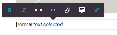
Enable or disable the existing elements for text formatting.
Example:
editor: {
  textFormatting: {
    bold: true,
    italic: true,
    superscript: false,
    subscript: false,
    link: true,
    specialChars: false,
    quotes: ['„', '“'],
    singleQuotes: ['‚', '‘'],
    smartQuotes: true,
    apostrophe: '’',
    locales: {
      de: {
        quotes: ['„', '“'],
        singleQuotes: ['‚', '‘']
      },
      en: {
        quotes: ['“', '”'],
        singleQuotes: ['‘', '’']
      }
    }
  }
}
Extend the text formatting toolbar with custom configured elements. The elements will be shown after the default elements. Add this configuration to the textFormatting configuration above.
Example:
customElements: [
  {
    label: 'blue color',
    handle: 'bluecolor',
    // if trim is set to true, whitespaces on the left and right of the selection are removed
    trim: true,
    // the tag which is set around the selection
    tagName: 'span',
    // the icon which will be displayed. Only existing icons in the editor can be used.
    icon: 'format-color-highlight',
    // the attributes which are set on the tag
    attributes: [{name: 'class', value: 'blue'}]
  }
]
Following attribute types can be added to a customElement:
static value
e.g. add to the class attribute on the customElement the value blue
{name: 'class', value: 'blue'}li-reference
Deprecated in:
release-2023-09Removed in:
Users can link a document. The attribute name is alwaysrelease-2023-11data-li-document-ref. And the references are extracted as with a normal link to a document.{ label: 'author link', handle: 'authorlink', tagName: 'span', icon: 'file-link', attributes: [ { handle: 'documentref', type: 'li-reference', config: {referenceType: 'document', contentType: 'author'} } ] }li-document-reference
Added in:
Users can link a document. The attribute name is alwaysrelease-2023-07data-li-document-ref. And the references are extracted as with a normal link to a document.{ label: 'author link', handle: 'authorlink', tagName: 'span', icon: 'file-link', attributes: [ { handle: 'documentref', type: 'li-document-reference', config: {contentType: 'author'} } ] }li-enum
Users can select a value from a list
{
  handle: 'specialprovider',
  type: 'li-enum',
  name: 'data-specialprovider',
  config: {
    dataProvider: {
      handle: 'specialprovider',
      type: 'labelValuePair',
      items: [
        {label: 'Batman', value: 'batman'},
        {label: 'Alfred', value: 'alfred'},
        {label: 'Robin', value: 'robin'},
        {label: 'Riddler', value: 'riddler'},
        {label: 'Joker', value: 'joker'},
        {label: 'Penguin', value: 'penguin'},
        {label: 'Mr. Freeze', value: 'freeze'}
      ]}
  }
}
li-text
Users can add a text value by themself
{
  label: 'input',
  handle: 'input',
  tagName: 'span',
  icon: 'format-color-highlight',
  attributes: [
    {
      handle: 'input',
      type: 'li-text',
      name: 'data-input'
    }
  ]
}
Restrictions
There can be only one attribute with a type in the attributes array. Static values can be added as many as needed.
Document Editing Toolbar
Configure available dashboards while editing a document.
editor: {
  documentEditingToolbar: {
    documentDashboards: [
      {
        label: 'Teaser',
        useDashboard: 'articles-simple',
        published: true
      }
    ]
  },
}
The print options allow you to enable the WoodWing Studio print connector on a content-type. Refer to our setup guide in order to setup your project with the print connector. Note: before you consider productive use of a print connector you must get in contact with us. The provided WoodWing connector is only to be used for test purposes.
Document Inbox
Changelog
release-2024-09: The inbox feature allows document and media references to be assigned to another document. Before, only media library entries could be sent to an inbox.release-2025-03: Images can be organized in groups too, and they can be assigned to the same inbox multiple times.release-2025-03: Removed support for videos and files in inbox.release-2025-05: The Document Inbox is now also supported for documents of type Data Record.release-2026-07: Inbox items can be kept in the inbox after being dropped into a document via thesettings.inbox.keepItemsOnDropproject setting.
Configuration
The following configuration allows the “page” content type to accept “regular” and “another-handle” documents, and “image” and “video” media library entries, into its inbox. The inbox assignment UI will be displayed for the “regular” and “another-handle” content types in the publish control panel. The “Send to inbox” link will be accessible in the context menu of the “image” and “video” media library entires on their dashboards.
Documents in an inbox are displayed similar to a Table Dashboard row. The column definition can be borrowed from a Table Dashboard config, by
using the useDashboardColumns property.
{
  handle: 'page',
  // ...
  inbox: {
    useDashboardColumns: 'inboxDashboard', // added in release-2024-09
    contentTypes: ['regular', 'another-handle'], // added in release-2024-09
    mediaTypes: ['image'] // changed in release-2025-03
  }
}
Keep Items on Drop
Added in: release-2026-07
By default, items are removed from the inbox once they are dragged into the document content. Set the inbox.keepItemsOnDrop project setting to true to keep items in the inbox after they are dropped, for example to place an item multiple times.
// projectConfig.settings
{
  inbox: {
    keepItemsOnDrop: true // Default: false
  }
}
The right value depends on how the inbox is used in a newsroom:
- Homepage curators typically want an item removed once it has been placed, so the inbox reflects what still needs to be published.
- Editors producing an article often research assets in the inbox and want to keep them while trying out different options.
For setups where both workflows exist, we recommend keeping items in the inbox (keepItemsOnDrop: true). Curators can then organize items into groups and delete a whole group once everything in it has been placed.
Documents
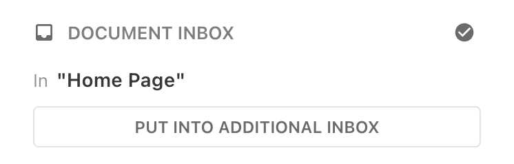
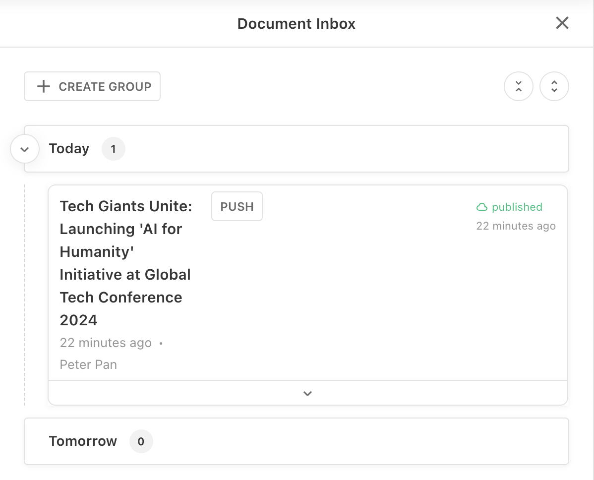
The document inbox for content types provides a way for users to indicate that a document should be listed within another document without the need to know in which spot it should appear.
An example use-case would be: When Editor User A finishes an article they would like to tell CvD User B (Chef vom Dienst - a role that is in charge of the frontpage at many newsrooms) to publish the teaser to that article on the frontpage. It’s not User A’s job to decide into which location the article should go, as it’s User B deciding that. Once User A has sent the article to the page inbox, User B will be able to see the article in the inbox, where it can be further organized in groups and subgroups before it is dragged into the page content and therefore removed from the inbox.
The inbox assignment UI will be displayed in the publish control panel for any content type listed within an inbox.contentTypes array. The document search dialog used for the inbox assignment will display documents with content type(s) that accept the content type of the document which is being published. The document can be sent to the inbox multiple times (duplicates).
Send document to another document (publish control panel):
Inbox with documents and groups:
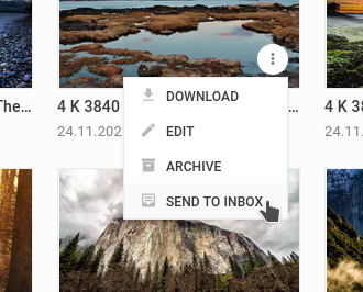
Media Library Entries
When a content type is configured to accept media library entries into its inbox it allows users to send images to specific documents. This can be achieved directly from the media library dashboards by using the “Send to inbox” link within the content menu of media library entries.
An example use-case would be: A user is interested in adding images to a document they are working on, but they are unsure which to use from an initial search, and would like to view a larger version of the images or get some additional context from the metadata. The user can search through the media library and then assign the images to the document they are working on. Once assigned to a document’s inbox the media can be dragged from the Inbox sidebar when the user is editing the document.
The “Send to inbox” option will only be displayed in a media library entry’s context menu if there is at least one content type which is configured to accept it. The document search dialog used for the inbox assignment will display documents with content type(s) that accept the media type of the media library entry.
Send an asset to a document inbox (Media Library):
Show asset inbox of a document in the Editor:
Images can be assigned to an Inbox multiple times at the same time. They appear alongside documents and have the same sorting and grouping functionality. It is also possible to add an Image to the Inbox directly from the Inbox using the “Add Image” button.
Comments
Comments can be globally enabled/disabled via Editor Config for articles or pages.
Once you did that globally, you can overrule the config here by Content Type.
editor: {
  comments: {
    isEnabled: false
  }
}
On-Read Migrations
Added in: release-2025-03
On-Read Migrations are applied whenever a document is read from the database. This means they take effect immediately, allowing all functions and clients consuming the data to work with the updated document structure. They are ideal for applying structural changes to existing documents.
Whenever you introduce a breaking change to a document design or metadata configuration, you must ensure that existing documents remain compatible. This is achieved by providing an On-Read Migration alongside these changes. Doing so ensures that documents delivered to the Livingdocs Editor or other clients remain consistent with the documents design and metadata properties.
On-Read Migrations require configuration in two parts:
- They must be defined as the
migrationsproperty in the Content Type config, referencing a registered migrate function. - The migrate function must be registered in the Migrate Function Registry.
For more details, refer to the On-Read Migration reference.