The editor settings control the behavior of your editor UX, in particular:
- Multi-Language UI
- User menu
- Main navigation
- Dashboards
- Task Screens
- Start page
- Document Creation Flows
- Document Copy Flows
- Document Transform Flows
- Media library
- Document lists
- Inline links
- Text formatting
An example:
editorSettings: {
  userMenu: [
    {
      label: 'What is new',
      data: {
        lastUpdate: '2020-06-16T13:19:38.560Z'
      },
      icon: 'plus',
      id: 'release_notes',
      group: 'string:required',
      // Use either 'href' (external link) or 'route' (internal link)
      href: 'https://github.com/livingdocsIO/livingdocs-release-notes',
      route: {
        name: 'app.state'
      }
    }
  ],
  mainNavigation: [
    {liItem: 'articles'},
    {liItem: 'pages'},
    { // custom document dashboard
      handle: 'authors',
      label: 'Authors',
      dashboard: 'authors-dashboard',
      icon: 'account'
    },
    { // custom task screen
      handle: 'review',
      label: 'Review',
      taskScreen: 'review',
      icon: 'clipboard-check'
    },
    { // custom task dashboard
      handle: 'proofreading',
      label: 'Proofreading',
      dashboard: 'kanban-proofreading',
      icon: 'clipboard-check'
    },
    {liItem: 'mediaLibrary'},
    {liItem: 'lists'},
    {liItem: 'menus'},
    {liItem: 'contentSetup'},
    { // external link
      handle: 'website',
      label: 'Livingdocs Website',
      href: 'https://www.livingdocs.io',
      icon: 'rocket',
      group: 'preferences' // Used for grouping before release-2022-03
    },
    {liItem: 'projectSettings'},
    {liItem: 'serverAdmin'}
  ],
  mainNavigationGroups: [
    {
      handle: 'documents',
      label: 'Documents',
      // items is an array of liItem or handle strings
      items: [
        'articles',
        'pages',
        'authors'
      ]
    },
    {
      handle: 'mediaLibrary',
      label: 'Media Library',
      items: ['mediaLibrary'] // Media library types are split, but remain in the same group
    },
    {
      handle: 'workflow',
      label: 'Workflow',
      items: ['review', 'proofreading'] // Using the handles of custom mainNavigation menu items
    },
    {
      handle: 'content-management',
      label: 'Content Management',
      secondary: true, // Group uses a grey background and is collapsed by default
      items: [
        'lists',
        'menus'
      ]
    },
    {
      // No label property makes the group non-collapsible, and appear like top-level items
      handle: 'website',
      secondary: true,
      items: ['website']
    },
    {
      handle: 'preferences',
      label: 'Settings', // Update the label name of the preferences group
      secondary: true,
      items: [
        'contentSetup',
        'projectSettings',
        'serverAdmin'
      ]
    }
  ],
  dashboards: [
    {
      handle: 'kanban-proofreading',
      type: 'taskBoard',
      pageTitle: 'Proofreading',
      taskName: 'proofreading',
      throttleTime: 2000, // ms
      displayFilters: ['documentState', 'timeRange']
    },
    {
      handle: 'authors-dashboard',
      type: 'dashboard',
      pageTitle: 'Author Management',
      entityLabel: 'Author',
      baseFilters: [
        {key: 'documentType', value: 'data-record'}
      ],
      displayFilters: ['documentState', 'timeRange'],
      sort: '-updated_at',
      fields: ['metadata.*'],
      componentName: 'bluewinDashboardListItem'
    }
  ],
  // you can define configured cards here, they can then be referenced
  // within a mediaType defining the card to be used for rendering in a dashboard
  dashboardCardConfigurations: [
    {
      handle: 'myImageCard',
      useCard: 'liMediaLibraryCard',
      options: {
        additionalInfo: [
          {
            metadataPropertyName: 'credit'
          }
        ]
      }
    },
    {
      handle: 'myVideoCard',
      useCard: 'liMediaLibraryCard',
      options: {
        additionalInfo: [
          {
            metadataPropertyName: 'credit'
          }
        ]
      }
    }
  ],
  taskScreens: [
    {
      handle: 'proofreading',
      pageTitle: 'Proofreading',
      task: 'proofreading',
      baseFilters: [{key: 'contentType', term: 'regular'}],
      displayFilters: ['timeRange', {metadataPropertyName: 'proofreading'}],
      // columns: [], // Used to replace the default columns
      additionalMetadataProperties: ['effort', 'importance'],
      search: {}
    }
  ],
  // The startPage config has no effect if a home screen is configured in the same project.
  startPage: {
    path: '/articles'
  },
  mediaLibrary: {
    showUi: true, // default true
    altTextPrefilling: [
      {
        metadataPropertyName: 'caption',
        onlyOnComponents: ['image']
      }
    ],
    componentDirectivesPrefilling: [
      {
        type: 'template',
        // Template placeholders support metadata string and number values
        // If a value is invalid/not present, it will continue with the next prefilling
        template: '{{ metadata.photographer }} / {{ metadata.credit }} ©️',
        directiveName: 'source'
      },
      {
        type: 'template',
        // acts as fallback if the first template wasn't able to extract values
        template: '{{ metadata.photographer }} ©️',
        directiveName: 'source'
      },
      {
        metadataPropertyName: 'caption',
        directiveName: 'caption' // Applies to all components with a caption directive
      }
    ]
  },

  documentLists: {
    card: {
      name: 'liDocumentListCard' // default, can be omitted
    },
    dashboard: {
      displayFilters: [],
      baseFilters: []
    }
  }

  // Note: the textFormatting config can be overwritten in a `contentType`
  textFormatting: {
    bold: true,
    italic: true,
    superscript: false,
    subscript: false,
    link: true,
    specialChars: true,
    quotes: ['„', '“']
    singleQuotes: ['‚', '‘'],
    smartQuotes: true,
    apostrophe: '’',
    locales: {
      de: {
        quotes: ['„', '“'],
        singleQuotes: ['‚', '‘']
      },
      en: {
        quotes: ['“', '”'],
        singleQuotes: ['‘', '’']
      }
    }
  }
}
Multi-Language UI
Configure UI languages(s) in editor:
app: {
  locale: 'de',
  availableLocales: ['de', 'en', 'fr', 'it']
}
For more details see the Multi-Language UI guide.
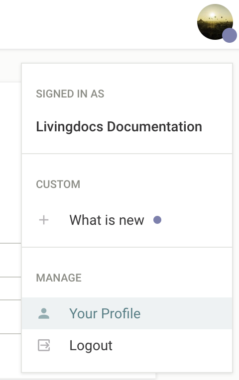
User Menu
Makes it possible to configure custom entries within the Livingdocs user menu. If given a userMenu.data.lastUpdate property, it will visually indicate changes to the user. While you can add additional menu items, it is not possible to remove or alter the default Livingdocs menu items.
Main Navigation
The main navigation menu items are configured using the mainNavigation array. Within this array you can either specify a predefined liItem, link to a custom dashboard, or link to an external page. If the mainNavigation array is not provided then all core liItem menu items will be added by default.
liItem
The possible values for liItem are: articles, pages, dataRecords, mediaLibrary, proofreading, lists, menus, tags (imatrics), contentSetup, projectSettings, serverAdmin (enterprise only) and imageCollections.
For each item you can either use the default properties defined by Livingdocs:
editorSettings: {
  mainNavigation: [{liItem: 'articles'}]
}
Or you can overwrite any of the default values:
{
  liItem: 'articles',
  label: 'Articles',
  icon: 'file-document',
  scope: 'readArticles'
}
Note: For imageCollections the value for scope will not have any effect.
Custom Dashboard
To link to custom dashboards you can provide the handle of your custom dashboard in the dashboard property:
{
  label: 'My Custom Dashboard',
  dashboard: 'my-custom-dashboard',
  icon: 'clipboard-check',
  scope: 'publishArticles'
}
The shorthand liItem: 'proofreading' can be used to point to a dashboard named kanban-proofreading.
Custom Task Screen
To link to custom task screens you can provide the handle of your custom task screen in the taskScreen property:
{
  handle: 'proofreading',
  taskScreen: 'proofreading',
  label: 'Proofreading',
  icon: 'clipboard-check'
}
External Link
To link to an external page you should set the href property:
{
  label: 'Livingdocs',
  href: 'https://livingdocs.io',
  icon: 'web'
}
Customizing menu items
You can customize the scopes that you assign to a menu item to control access rights. Menu items that the user does not have access to will be hidden. See all available scopes.
You can also customize the icons by providing an icon string. Please see the Icons guide for further details of the icons available.
To remove an entry, simply delete it from the mainNavigation array. If you have not defined the mainNavigation array, and are relying on the core menu items, then you will need to configure the array with the menu items you would like to include.
Main Navigation Groups
To create custom groups for menu items you can use the mainNavigationGroups configuration. Within this array you should create an object for each group, and then define the menu items which belong to it by adding their handle or liItem value as a string in the items array. A group handle should be defined, and it’s also possible to provide a label string, and to change the style by setting the boolean secondary property.
By default the main navigation items will be placed as top-level items in the menu, with the exception of ‘contentSetup’, ‘projectSettings’, and ‘serverAdmin’, which will be added to the ‘preferences’ and ‘admin’ groups.
editorSettings: {
  mainNavigation: [
    // ...
  ],
  mainNavigationGroups: [
    {
      // Simple group linking to liItem menu items
      handle: 'documents',
      label: 'Documents',
      items: [
        'articles',
        'pages',
        'authors'
      ]
    },
    {
      // The {liItem: 'mediaLibrary'} will be split into a separate dashboard for each media type
      handle: 'media',
      label: 'Media Library',
      items: ['mediaLibrary']
    },
    {
      // A group for custom workflow dashboards
      handle: 'workflow',
      label: 'Workflow',
      items: ['proofreading', 'review']
    },
    {
      // Top-level external link (no label)
      handle: 'website',
      secondary: true, // Grey background
      items: ['website']
    },
    {
      // Merge the admin and preferences groups, and change the label name
      handle: 'preferences',
      label: 'Settings',
      secondary: true,
      items: [
        'contentSetup',
        'projectSettings',
        'serverAdmin'
      ]
    }
  ]
}
For releases prior to release-2022-03 you should specify a group property on the menu item within the mainNavigation array. The available values are ‘admin’, ‘preferences’, ‘dashboards’, ‘custom’, and ’top’.
Dashboards
The dashboards entry allows you to configure custom dashboards, e.g. for authors (data-records) or proofreading (tasks).
There are 5 types of custom dashboards (type property):
dashboardkanbanBoardtaskBoard(predefinedkanbanBoardfor a task)tableDashboardmediaLibraryDashboard
Kanban Boards are very similar to dashboards, except for having multiple result columns. Each result column shows a list of documents just as a single column dashboard does. The documents cannot be manually sorted or moved between columns, instead each column typically has its own filter settings.
For example a task board will show all tasks in the requested state in one column and tasks with the state inProgress and done in the other columns. In order to move a card into another column you simply have to open the document and move the task into another state.
Common Dashboard Properties
Custom dashboards have some basic properties in common which are described in more detail below.
handle
Identifier for a custom dashboard. It’s also used as a reference for the main navigation
type
Type of the dashboard, one of these: dashboard, kanbanBoard, taskBoard, tableDashboard, mediaLibraryDashboard
displayFilters
Display Filters are filters that the user can set in the UI (below the search input).
baseFilters
Base Filters are invisible filters and applied to every search (including the default result list).
sort
It’s a shorthand to define sortBy properties applied to baseFilters.
Defines the order of the elements in a dashboard.
Possible values are:
-updated_at/updated_at(Default),-created_at/created_at,title- any metadata property e.g.
metadata.proofreading.priority
When a query string is present, sorting is defined by the relevance with the search term.
Example: Media Library Dashboard
For a detailed example and additional guidance on configuring a Media Library Dashboard, see the Media Library Dashboard Configuration guide.
Example: Dashboard
dashboards: [
  {
    handle: 'gallery-dashboard',
    type: 'dashboard',
    pageTitle: 'Gallery Board',
    // Label used to describe the documents in this Dashboard
    entityLabel: 'Article',
    // Invisible base filters applied to every search (including the default result list)
    baseFilters: [{key: 'documentType', term: 'article'}],
    // Filters shown to the user below the search input
    displayFilters: ['documentState', 'timeRange'],
    sort: '-updated_at',
    // fields to be returned from the server (not all metadata fields are returned by default)
    fields: ['metadata.*'],
    // Enterprise only: This is the name of the vue component used in the result list
    componentName: 'liHeroCard',
    // Enterprise only: The componentOptions are injected into the component
    // `liHeroCard` (in this example)
    componentOptions: {teaserImage: 'teaserImage'},
    // Enterprise only: CSS class set as a wrapper around the result list
    cssWrapper: 'li-result-columns'
  }
]
Example: Taskboard (simple config)
dashboards: [
  {
    handle: 'kanban-proofreading',
    type: 'taskBoard',
    pageTitle: 'Proofreading',
    // This is the name of a metadataProperty of `type: 'li-task-v2'`
    taskName: 'proofreading',
    displayFilters: ['documentState', 'timeRange']
  }
]
Example: Kanbanboard (full config)
dashboards: [
  {
    handle: 'kanban-proofreading',
    type: 'kanbanBoard',
    pageTitle: 'Proofreading',
    // Label used to describe the documents in this KanbanBoard
    entityLabel: 'Article',
    displayFilters: [],
    // Base filters are applied to all columns
    baseFilters: [{key: 'documentType', term: 'article'}],
    // This is the name of the angular component to use in all columns
    // (can also be defined for each columns separately)
    componentName: 'liTaskCard',
    // include all metadata properties in the search response data
    fields: ['metadata.*'],
    // Set the target when clicking on a card. Currently supported:
    // - 'article' (default setting)
    // - 'tasks'
    openState: 'tasks',
    showFooter: true,
    columns: [
      {
        handle: 'requested',
        label: 'Needs Proofreading',
        // Filter applied for this column on top of the `baseFilter`
        columnFilter: [{key: 'metadata.proofreading.state', term: 'requested'}],
        sort: [`metadata.proofreading.priority`, `metadata.proofreading.deadline`],
        // The componentOptions are injected into the component `liTaskCard` (in this example)
        componentOptions: {column: 'todo', taskName: 'proofreading'}
      },
      {
        handle: 'in-progress',
        label: 'In Progress',
        columnFilter: [{key: 'metadata.proofreading.state', term: 'accepted'}],
        sort: [`metadata.proofreading.priority`, `-metadata.proofreading.accepted.date`],
        componentOptions: {column: 'doing', taskName: 'proofreading'}
      },
      {
        handle: 'done',
        label: 'Finished Proofreading',
        columnFilter: [{key: 'metadata.proofreading.state', term: 'completed'}],
        sort: [`-metadata.proofreading.completed.date`],
        componentOptions: {column: 'done', taskName: 'proofreading'}
      }
    ]
  }
]
Example: Table Dashboard
dashboards: [
  {
    handle: 'example-table-dashboard',
    type: 'tableDashboard',
    pageTitle: 'Table Dashboard Title',
    baseFilters: [{key: 'documentType', term: 'article'}],
    displayFilters: [
      'channels',
      'documentState',
      'contentType',
      'timeRange',
      'language',
      'category'
    ],
    sort: '-updated_at',
    columns: [
      {
        label: 'Title',

        minWidth: 100, // minimum width in pixels

        growFactor: 1, // share of the remaining space after
        // minWidth of all columns has been allocated
        // (works like flex-grow in CSS)

        priority: 1, // If there is not enough space for all columns
        // keep those with priority 1, then 2, etc.

        // Name of the Vue component used for this column
        componentName: 'liTableDashboardCellMain',

        // Custom options passed to the above component
        componentOptions: {
          image: {
            metadataPropertyName: 'teaserImage'
          },
          clampTitle: false,
          showContentType: true
        }
      },
      {
        label: 'Description',
        minWidth: 200,
        growFactor: 3,
        priority: 3,

        // Columns can also display a metadata property instead of using a custom component
        metadataPropertyName: 'description',

        // default false, if true, metadata property can be edited inline in the dashboard
        editable: true
      }
    ],

    // adds a Document Creation Flow to the dashboard (e.g. custom button, custom create modal, custom create function)
    documentCreationFlows: [{useDocumentCreationFlow: 'breakingNews'}]
  }
]
Supported metadata properties
See the metadata plugin list to understand which metadata plugins have support for a table dashboard cell already. Livingdocs aims to support all of them, if something is missing, please reach out.
Upstream components
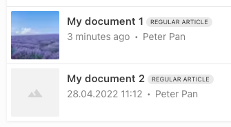
liTableDashboardCellMain
The liTableDashboardCellMain upstream component can be used to display document thumbnail, title, content type, and last modification / author:
Options:
componentOptions: {
  image: {
    // Name of metadata property to be used for thumbnail image
    metadataPropertyName: 'teaserImage'
  },
  // Clamp title to max 3 rows
  clampTitle: false,
  // Show content type tag
  showContentType: true,
  // Only works if no displayTitlePattern is configured on the contentType
  allowTitleEdit: true

}
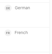
liTableDashboardCellLanguage
The liTableDashboardCellLanguage upstream component can be used to display the document language:
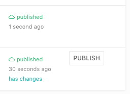
liTableDashboardCellPublishState
The liTableDashboardCellPublishState upstream component can be used to display publish state and quick publish button
(only shown if metadata has been edited directly within the table dashboard).
With release-2023-05 and following, allowQuickPublish: true is required to show the quick publish button.
{
  label: 'Published',
  minWidth: 200,
  growFactor: 0,
  priority: 2,
  componentName: 'liTableDashboardCellPublishState',
  componentOptions: {
    allowQuickPublish: true
  }
},
liTableDashboardCellTaskList
Added in: release-2023-03
The liTableDashboardCellTaskList gives an overview of current tasks connected with the given document.
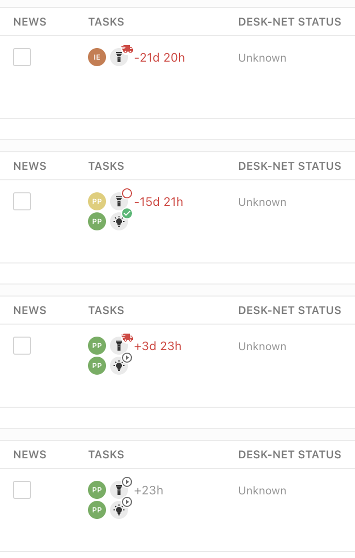
columns: [
  ...,
  {
    label: 'Tasks',
    editable: false,
    minWidth: 150,
    growFactor: 0,
    priority: 2,
    componentName: 'liTableDashboardCellTaskList',
    componentOptions: {
      tasks: ['proofreading'] // filter which tasks to show
    }
  }
]
liTableDashboardCellStatistics
Added in: release-2024-05
The liTableDashboardCellStatistics displays Document Statistics such as component count, character count and line count (depending on provided componentOptions).
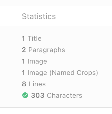
To display the character count, set componentOptions.characterCount to true.
If projectConfig.editorSettings.textCount.lineCountFraction is defined here, also the line count will be displayed.
Component counts are shown for all components listed in the componentOptions.compomnentCount array.
Please make sure to provide a pluralized label string for those components in their design declaration by separating the singular and plural label string with a pipe character (|).
Example: {label: 'Paragraph | Paragraphs', ...}
columns: [
  ...,
  {
    label: 'Statistics',
    minWidth: 200,
    growFactor: 1,
    priority: 2,
    componentName: 'liTableDashboardCellStatistics',
    componentOptions: {
      characterCount: true,
      componentCount: [
        'p',
        'title',
        'image',
        'image-named-crops'
      ]
    }
  }
]
liTableDashboardCellPrint
Added in: release-2024-11
The liTableDashboardCellPrint cell provides a quick overview of the state of print versions of web articles. The cell shows the print icon when a print copy exists, and clicking on it will open the print document. It also uses a small dot to indicate that the web version has changed since the print copy was created. Document Print Flows must be configured to use this cell.
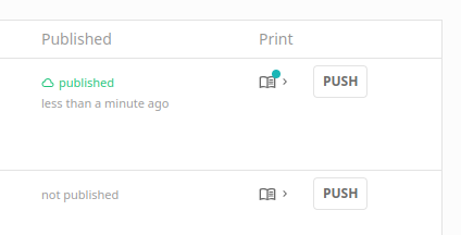
columns: [
  ...,
  {
    label: {en: 'Print', de: 'Druck'},
    minWidth: 50,
    growFactor: 0,
    priority: 2,
    componentName: 'liTableDashboardCellPrint'
  }
]
Custom components
Custom components of type tableDashboardCell can be used to render custom content inside a table cell.
Task Screens
The configuration of task screens is similar to that of table dashboards. The screen configs use many of the same properties, but they have a required task property which should reference an li-task-v2 metadata property handle. There is also an additionalMetadataProperties property which accepts an array of metadata handles. This will add columns after the default columns, which can be used as a simple way to extend what is displayed on the screen without having to define the whole columns array.
Example
taskScreens: [
  {
    handle: 'proofreading',
    pageTitle: 'Proofreading',
    task: 'proofreading',
    baseFilters: [{key: 'contentType', term: 'regular'}],
    displayFilters: ['timeRange', {metadataPropertyName: 'proofreading'}],
    // columns: [], // Used to replace the default columns
    additionalMetadataProperties: ['effort', 'importance'], // Used to extend the default columns
    search: {}
  }
]
startPage
Set custom startPage: {path: '/my-custom-path'}} to set the path used to render on login or when switching projects.
Notice: The startPage config will have no effect if a home screen is configured in the same project.
Home Screen
When configured on a project, the home screen will be the start page on login or when switching projects.
Notice: The startPage config will have no effect if a home screen is configured in the same project.
The home screen can display multiple Table Dashboard on the same page and has Document Creation Flow buttons in the main toolbar.
// projectConfig.editorSettings
homeScreen: {
  dashboards: [
    {
      // Handle of the dashboard to show
      useDashboard: 'articles',
      // Hides the dashboard search input field (optional, default: false)
      hideSearchInput: true,
      // Title to show over the dashboard (optional, default: dashboard.pageTitle)
      dashboardTitle: 'Recommended Articles',
      // Use a custom dashboard source (see dashboard sources documentation below)
      dashboardSourceHandle: 'recommendedArticlesSource'
    },
    {
      useDashboard: 'example-table-dashboard'
    }
  ],
  documentCreationFlows: [
    {
      // Handle of a Document Creation Flow
      useDocumentCreationFlow: 'articles'
    },
    {
      useDocumentCreationFlow: 'breakingNews',
      // Render as primary button
      primary: true
    }
  ]
}
Dashboard Sources
Dashboards on the home screen are eligible of using Dashboard Sources. This means the Table Dashboards can display documents, that are not returned by the regular document search. A use case for this could be a personalized list of recommended articles that are determined by custom queries or even an external system.
Limitations:
- No display filters or base filters available
- Maximum number of results are limited to 35
- No pagination supported
Document Creation Flows
With a Document Creation Flow you can define how a document gets created (e.g. create button for a Dashboard).
Check that guide for more information.
// projectConfig.editorSettings
documentCreationFlows: [
  {
    handle: 'breakingNews',
    // register a createFunction with liServer.registerCreateFunction()
    // default createFunction handle: 'liDefaultCreationFunction'
    createFunction: 'breakingNews',
    createButtonLabel: 'Create Breaking News',

    // shows title and urgency field in the create modal
    // the config is the same as for metadata plugins
    paramsSchema: [
      {handle: 'title', type: 'li-text'},
      {handle: 'urgency', type: 'li-number'}
    ],

    // values passed to paramsSchema fields as initial value
    defaultParams: {
      urgency: 5
    },

    // additional info for your createFunction
    context: {
      projectType: 'flex',
      contentType: 'regular'
    }
  }
]
Document Copy Flows
Added in: release-2024-09
Document Copy Flows define how a document gets copied to another document. This feature allows for the transformation of content and metadata to match different content types or scenarios.
Note: This feature is separate from the declarative copy feature and is designed with different mechanics. The older declarative copy feature will be deprecated and removed in future versions.
// projectConfig.editorSettings
documentCopyFlows: [
  {
    handle: 'copyWebToPrint',
    // register a copyFunction with liServer.registerCopyFunction()
    copyFunction: 'copyWebToPrint',
    copyButtonLabel: 'Copy to Print',
    copyDescription: 'Copy the current web article to a new print article',
    copyIcon: 'newspaper',

    sourceLabel: 'Original Web Article',
    targetLabel: 'Print Copy',

    // shows title and section field in the copy modal
    // the config is the same as for metadata plugins
    paramsSchema: [
      {handle: 'workingTitle', type: 'li-text'},
      {handle: 'section', type: 'li-text'}
    ],

    // values passed to paramsSchema fields as initial value
    defaultParams: {section: 'News'},

    // additional info for your copyFunction
    context: {}
  }
]
liServer.registerCopyFunction({
  handle: 'copyWebToPrint',
  async copy({projectConfig, documentVersion, params, context}) {
    return {
      title: params.workingTitle,
      metadata: {
        ...documentVersion.metadata.toJSON(),
        section: params.section,
        platform: 'print'
      },
      // you can override the content if you like
      // The default behavior is that the content is copied as is
      content: document.content
    }
  }
})
Document Print Flows
Added in: release-2024-11
Document Print Flows provide a flexible way to create print copies of web documents. They are similar to Document Copy Flows, but they have a different UI based on a 1:1 relationship between a print and web document.
// projectConfig.editorSettings
documentPrintFlows: [
  {
    handle: 'regularToPrint',
    // register a printFunction with liServer.registerPrintFunction()
    printFunction: 'webToPrintFunction',
    direction: 'web-to-print',
    printButtonLabel: {
      en: 'Make Short Format Print Version',
      de: 'Kurzformatigen Druckartikel Erstellen'
    },
    printDescription: 'Only text will be copied, and only some contextual metadata will be cleared',
    printIcon: 'format-align-justify',

    // additional info for your copyFunction
    context: {}
  }
]
liServer.registerPrintFunction({
  handle: 'webToPrintFunction',
  copy({projectConfig, document, userId, context}) {
    return {
      title: `Print version of: ${document.title}`,
      contentType: 'print',
      content: filterComponents(document.content, allowedComponents),
      metadata: filterMetadata(document.metadata.toJSON(), allowedMetadata)
    }
  }
})
Document Transform Flows
Added in: release-2024-09
Document transform flows allow you to transform a document to either the same content type or a different one.
Documents can only be transformed to a different content type if the document was never published before.
Note: This feature is separate from the declarative transform feature and is designed with different mechanics. The older declarative transform feature will be deprecated and removed in future versions.
// projectConfig.editorSettings
documentTransformFlows: [
  {
    handle: 'convertArticleToGallery',
    // register a transformFunction with liServer.registerTransformFunction()
    transformFunction: 'convertArticleToGallery',
    transformButtonLabel: 'Convert to gallery article',
    transformDescription: '...',
    transformIcon: 'image-area',

    // shows working title in the transform modal
    // the config is the same as for metadata plugins
    paramsSchema: [{handle: 'workingTitle', type: 'li-text'}],

    // values passed to paramsSchema fields as initial value
    defaultParams: {},

    // additional info for your transformFunction
    context: {}
  }
]
liServer.registerTransformFunction({
  handle: 'convertArticleToGallery',
  async transform({params, documentVersion, context}) {
    return {
      contentType: 'gallery',
      title: params.workingTitle || documentVersion.title,
      content: await transformToGalleryContent(documentVersion.content)
    }
  }
})
Media Library
Dashboards
You can find all information on how to configure a Media Library Dashboard in the Media Library guide.
Dashboard Cards
You can configure the card used to show results in dashboards. You do this by configuring your own dashboard card in the project config under editorSettings.dashboardCardConfigurations and then define this card per mediaType as you please.
Additional metadata
Available as option for liMediaLibraryCard.
Each metadata property shows up as an individual bullet point, where label and value differ in their font weight. Properties with missing values remain visible as bullet points, which improves consistency when looking through results.
Supported plugin types in additionalInfo:
li-textli-document-referenceli-integer(Added in:release-2025-09)li-boolean(Added in:release-2025-09)li-date(Added in:release-2025-09)li-date-time(Added in:release-2025-09)li-enum(Added in:release-2025-09)li-string-list(Added in:release-2025-09)li-media-handle(Added in:release-2025-09)
Since release-2025-09, additional metadata is no longer displayed by default! Users have to switch it on via the “Show metadata” control in the filter bar. The choice is remembered in local storage.
Display options
Each entry in additionalInfo supports two optional display properties (Added in: release-2026-07):
showLabel: Set tofalseto hide the property’s label. Useful when the label is redundant or self-explanatory. The label is shown unless explicitly set tofalse.maxLineCount: Collapse the value after the given number of lines, with a toggle to expand it. Only positive integers (> 0) are allowed.
additionalInfo: [
  {
    metadataPropertyName: 'description',
    showLabel: false, // Optional, shown unless explicitly set to false
    maxLineCount: 5 // Optional, positive integers only
  }
]
Title
Added in: release-2025-09
Available as option for liMediaLibraryCard.
We allow the title to take up to three lines of text before we truncate it. Additionally, you no longer have to name your metadata property title or caption. We still look in there by default to display the title, but you can now also provide a mapping configuration yourself (see an example configuration further down).
Date
Added in: release-2025-09
Available as option for liMediaLibraryCard.
By default, we’re showing the date when an image was uploaded or imported next to the image. In some cases, it might be more suitable to show the date when the photo was taken. You can do that as well by providing a mapping configuration as well (see an example configuration further down).
Credit
Added in: release-2025-09
Available as option for liMediaLibraryCard.
Some customers were using the additional metadata configuration to show a credit line. As described above, the display of the additional metadata has changed, so we decided to introduce a dedicated spot in the card to display credit or copyright information. It is now possible to provide a mapping configuration for the credit line independent of other displayed metadata information (see an example configuration further down).
Example Card Configurations
For liMediaLibraryCard, the options title, date and credit support the same metadata mapping rules that are already known from directive prefilling. Each option accepts an array of mapping rules. A rule can point to a metadata property by name, or it can use a template string where multiple metadata properties are accessible.
A rule applies if all referenced properties exist and store a non-empty string value. Otherwise, we evaluate the next rule.
// projectConfig.editorSettings

dashboardCardConfigurations: [
  {
    handle: 'myImageCard',
    useCard: 'liMediaLibraryCard',
    options: {
      // Added in release-2025-09
      // Optional, with template and fallback support.
      // Defaults to metadata.title and metadata.caption.
      title: [
        {
          type: 'template',
          template: '«{{metadata.title}}»'
        }
      ],
      // Added in release-2025-09
      // Defaults to mediaLibraryEntry.createdAt.
      date: [{metadataPropertyName: 'capturedAt'}],
      // Added in release-2025-09
      // Optional, with template and fallback support.
      // No default.
      credit: [
        {metadataPropertyName: 'CopyrightNotice'},
        {metadataPropertyName: 'rightsInfo/copyrightNotice'},
        {
          type: 'template',
          template: '{{metadata.CopyrightOwner}} / {{metadata.Creator}}'
        }
      ],
      // Existing option
      // No template and fallback support.
      // All properties are displayed regardless of their presence in the metadata.
      additionalInfo: [{metadataPropertyName: 'description'}, {metadataPropertyName: 'UsageTerms'}]
    }
  },
  {
    handle: 'myDocumentListCard',
    useCard: 'liDocumentListCard',
    options: {
      // the liDocumentListCard supports the rendering of an additional Vue component
      // inside. This component is configured here, it has to be registered with the vueComponentRegistry
      uiExtensionComponent: {
        name: 'liDocumentListCardExtensionRocket'
      }
    }
  }
]
This will define a card myImageCard to be used in mediaType.editor.dashboard.card.name. See the See Media Type config example.
Prefilling Behavior
Then there are 2 configs to define the behavior when Images are inserted into a Document from the Media Library:
Alt Text Prefilling
mediaLibrary.altTextPrefilling: [
  {
    metadataPropertyName: 'title',
    onlyOnComponents: ['image']
  }
]
Provide a metadata property handle from which the alt attribute on an image tag is filled. This value will also be stored within the document content using the altText property on the directive content. To limit the prefilling to a subset of components you can optionally provide an array of component names using the onlyOnComponents property. Providing multiple objects within the array will allow you to have fallbacks when the metadata property has no value, or to specify different properties for different components.
Component Directives Prefilling
There are two ways to prefill component directives with Media Library Entry Metadata. You can either use a template string or directly reference a metadata property. With the template string, you can use metadata properties as placeholders. If a value is invalid or not present, it will continue with the next prefilling, thus acting as a fallback. Below an example with a template string and a direct metadata property reference:
mediaLibrary.componentDirectivesPrefilling: [
  {
    type: 'template',
    template: '{{ metadata.photographer }} / {{ metadata.credit }} ©️',
    directiveName: 'source'
  },
  {
    type: 'template',
    template: '{{ metadata.photographer }} ©️', // Fallback if credit is not set
    directiveName: 'source'
  },
  {
    type: 'template',
    template: '{{ metadata.credit }} ©️', // Fallback if photographer is not set
    directiveName: 'source'
  },
  {
    metadataPropertyName: 'source',
    directiveName: 'image.source' // Component prefix
  },
  {
    metadataPropertyName: 'description',
    directiveName: 'caption' // Applies to all components with a caption directive
  }
]
In this example, both entries have the same behavior, with template and metadata property reference.
mediaLibrary.componentDirectivesPrefilling: [
  {
    type: 'template',
    template: '{{ metadata.description }}',
    directiveName: 'caption'
  },
  {
    metadataPropertyName: 'description',
    directiveName: 'caption'
  }
]
An array of mappings to prefill doc-editable directives with Media Library Entry Metadata. The metadata value must be a string. The directive name can be prefixed with a component name to limit where the prefill will be used, for example “image.source”. To limit the prefilling to multiple components you will need to add multiple objects to the array.
Document Lists
documentLists: {
  card: {
    // defaults to liDocumentListCard provided by Livingdocs
    // can be any card registered in the vueComponentRegistry or
    // a configured one from dashboardCardConfigurations
    name: 'myDocumentListCard'
  },
  dashboard: {
    useDashboard: 'myCustomDashboard'
    displayFilters: [],
    baseFilters: [
      {key: 'documentType', term: 'article'},
      {key: 'lastPublicationId', exists: true}
    ]
  }
}
Inline Links
inlineLinks: {
  dashboard: {
    useDashboard: 'myCustomDashboard'
    displayFilters: [],
    baseFilters: [
      {key: 'documentType', term: 'article'},
      {key: 'lastPublicationId', exists: true}
    ]
  }
}
To allow inlineLinks to internal documents, you need at least one delivery configured.
useDashboard
useDashboard defines which dashboard is going to be renderered when the user clicks on Extended Search.
displayFilters
Display Filters are filters that the user can set in the UI (below the search input).
baseFilters
Base Filters are invisible filters and applied to every search (including the default result list).
Anchor Links
To enable anchor linking (link to a section within a document), configure editable directives in design settings.
Text Formatting
The text formatting toolbar can be customized globally here. You can also overwrite this config for each content type.
Enable or disable the existing elements for text formatting:
textFormatting: {
  bold: true,
  italic: true,
  superscript: false,
  subscript: false,
  link: true,
  specialChars: false,
  quotes: ['„', '“'],
  singleQuotes: ['‚', '‘'],
  smartQuotes: true,
  apostrophe: '’',
  locales: {...}
}
Extend the text formatting toolbar with custom configured elements. The elements will be shown after the default elements. Add this configuration to the textFormatting configuration above.
customElements: [
  {
    label: 'blue color',
    handle: 'bluecolor',
    // if trim is set to true, whitespaces on the left and right of the selection are removed
    trim: true,
    // the tag which is set around the selection
    tagName: 'span',
    // the icon which will be displayed. Only existing icons in the editor can be used.
    icon: 'format-color-highlight',
    // the attributes which are set on the tag
    attributes: [{name: 'class', value: 'blue'}]
  }
]
Following attribute types can be added to a customElement:
static value
e.g. add to the class attribute on the customElement the value blue
{name: 'class', value: 'blue'}li-reference
Deprecated in:
release-2023-09Removed in:
Users can link a document. The attribute name is alwaysrelease-2023-11data-li-document-ref. And the references are extracted as with a normal link to a document.{ label: 'author link', handle: 'authorlink', tagName: 'span', icon: 'file-link', attributes: [ { handle: 'documentref', type: 'li-reference', config: {referenceType: 'document', contentType: 'author'} } ] }li-document-reference
Added in:
Users can link a document. The attribute name is alwaysrelease-2023-07data-li-document-ref. And the references are extracted as with a normal link to a document.{ label: 'author link', handle: 'authorlink', tagName: 'span', icon: 'file-link', attributes: [ { handle: 'documentref', type: 'li-document-reference', config: {contentType: 'author'} } ] }li-enum
Users can select a value from a list
{
  handle: 'specialprovider',
  type: 'li-enum',
  name: 'data-specialprovider',
  config: {
    dataProvider: {
      handle: 'specialprovider',
      type: 'labelValuePair',
      items: [
        {label: 'Batman', value: 'batman'},
        {label: 'Alfred', value: 'alfred'},
        {label: 'Robin', value: 'robin'},
        {label: 'Riddler', value: 'riddler'},
        {label: 'Joker', value: 'joker'},
        {label: 'Penguin', value: 'penguin'},
        {label: 'Mr. Freeze', value: 'freeze'}
      ]}
  }
}
li-text
Users can add a text value by themself
{
  label: 'input',
  handle: 'input',
  tagName: 'span',
  icon: 'format-color-highlight',
  attributes: [
    {
      handle: 'input',
      type: 'li-text',
      name: 'data-input'
    }
  ]
}
Restrictions
There can be only one attribute with a type in the attributes array. Static values can be added as many as needed.
Smart Quotes
A feature, which automatically replaces quotation marks as you type with the appropriate ones defined in your configuration. This enhancement helps editors maintain high-quality typography without manual effort. With the provided switch in the editor UI, users are allowed to disable the feature when necessary for special cases.
How to Use Smart Quotes
To enable the Smart Quotes toggle, the smartQuotes property must be added to the textFormatting configuration. This can be done in editor_settings.js. You can also overwrite this config for each content type.
Additionally, either the quotes & singleQuotes properties or the locales property must be set in textFormatting, as these will be used as replacement quotes.
// Either in editor_settings.js or content-types/*
textFormatting: {
  smartQuotes: {enabled: true}, // Alternatively: `smartQuotes: true``
  quotes: ['«', '»'],
  singleQuotes: ['‹', '›'],
  // Either quotes and singleQuotes OR locales need to be set
  locales: {
    en: {
      quotes: ['“', '”'],
      singleQuotes: ['‘', '’']
    },
    de: {
      quotes: ['«', '»'],
      singleQuotes: ['‹', '›']
    }
  }
}
// ...
Once configured, the Smart Quotes toggle will be available in the editor on the bottom left corner. Each time a document is opened, the toggle will be turned on by default. Users can turn off the toggle when needed, allowing flexibility for special cases where standard quotation marks are required.
Text Count
 A version of this configuration for releases prior to
 A character counter can be configured. The counter can be limited to only count text within certain components.
textCount: {
  isEnabled: true,
  showEditableCount: true, // shows the chars of the selected doc-editable
  timeout: 200,
  lineCountFraction: 39.5 // required to calculate a line count based on character count
}

Excluding components and directives (configured in the Livingdocs component library)
It is also possible to only count the text of selected components or directives. This is configured in the component library of a Livingdocs design.
Exclude whole components from the text counter (example component config):
{
  "name": "aside",
  "label": "Aside",
  "excludeFromTextCount": true
}
Exclude individual directives from the text counter (example component config):
{
  "name": "quote",
  "label": "Quote",
  "directives": {
    "text": {"excludeFromTextCount": true},
    "source": {"excludeFromTextCount": true}
  }
}